The topic “Comparing Levels of Air Pollution in Different Cities (2000-2023)” is not only relevant in terms of environmental studies but also an essential one for the IELTS Writing Task 1. It often appears in the form of line graphs, bar charts, or tables in the IELTS exam. Being prepared to interpret and describe such data is crucial for achieving a high band score. In this article, we will explore the topic thoroughly and provide a sample task with a detailed analysis and model answer.
Sample Task Analysis
Task Prompt
You should spend about 20 minutes on this task.
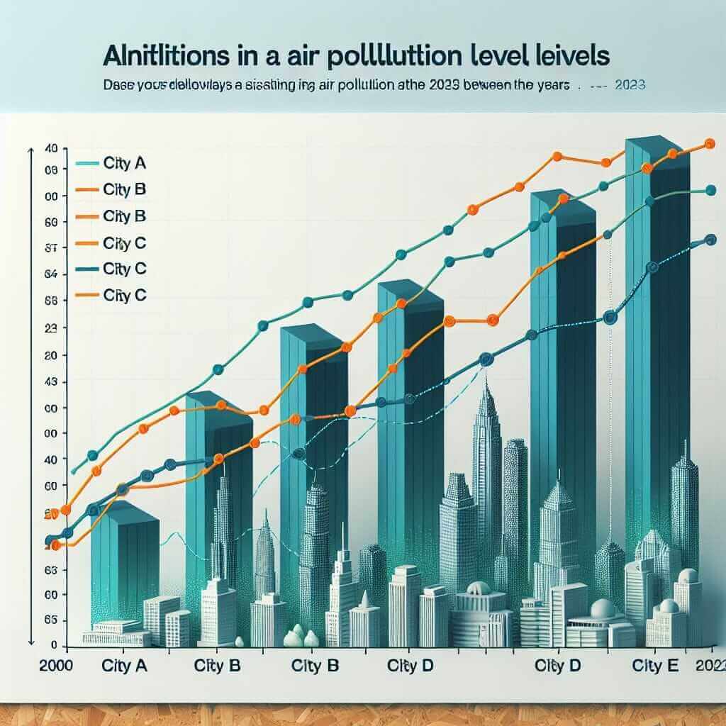
The chart below shows the levels of air pollution measured in micrograms per cubic meter (µg/m³) in five different cities from 2000 to 2023.
Summarize the information by selecting and reporting the main features, and make comparisons where relevant.
Write at least 150 words.
Understanding the Data
Before diving into the sample answer, it is essential to understand the type of data presented. The graph typically shows trends over time and how air pollution levels have changed in various cities. Key factors to notice may include:
- Trends: Increase, decrease, or stable levels of pollution.
- Comparisons: Which cities have higher or lower pollution levels?
- Significant changes: Noticeable spikes or drops in pollution levels.
Sample Line Graph
Let’s create a theoretical line graph for air pollution levels in five cities (City A, City B, City C, City D, City E) over the years 2000 to 2023.
| Year | City A (µg/m³) | City B (µg/m³) | City C (µg/m³) | City D (µg/m³) | City E (µg/m³) |
|---|---|---|---|---|---|
| 2000 | 65 | 40 | 35 | 60 | 70 |
| 2005 | 70 | 45 | 37 | 65 | 72 |
| 2010 | 75 | 50 | 40 | 70 | 75 |
| 2015 | 80 | 55 | 43 | 75 | 77 |
| 2020 | 85 | 58 | 45 | 80 | 80 |
| 2023 | 90 | 60 | 50 | 85 | 83 |

Analyzing the Task
Selecting Key Features
The key features should include:
- The overall trends (e.g., all cities show an increase in pollution levels over the years).
- Specific values at significant years (e.g., maximum and minimum pollution levels).
- Notable comparisons between the cities (e.g., which city had the highest/lowest levels in specific years).
Sample Model Answer
The line graph illustrates the levels of air pollution measured in micrograms per cubic meter (µg/m³) across five cities (City A, City B, City C, City D, and City E) from 2000 to 2023.
Overall, it can be observed that air pollution levels have generally increased in all five cities over the given period. City A had the highest levels of air pollution throughout the years, starting at 65 µg/m³ in 2000 and rising steadily to 90 µg/m³ in 2023. In contrast, City C consistently showed the lowest levels, increasing modestly from 35 µg/m³ to 50 µg/m³ over the same period.
More specifically, all cities experienced significant increases, with City E experiencing a noticeable rise from 70 µg/m³ in 2000 to 83 µg/m³ in 2023. City B and City D followed similar upward trends, with City B increasing from 40 µg/m³ to 60 µg/m³ and City D from 60 µg/m³ to 85 µg/m³. City B showed the smallest overall change, whereas City D had the second-highest pollution levels by the end of the period.
In summary, there is a clear upward trend in air pollution levels among these cities, with City A and City D exhibiting the most significant increases. This highlights the growing environmental concerns that these urban areas need to address.
(Word count: 206)
Tips for Writing Task 1
-
Identify Key Features:
- Always begin by identifying the main trends and significant data points.
-
Use Comparative Language:
- Employ phrases like “more than,” “less than,” “similar to,” and “as much as.”
-
Structure Your Answer:
- Introduction: Brief overview of the graph.
- Body Paragraphs: Detailed description of trends and comparisons.
- Conclusion: Summarize the key points.
Vocabulary and Grammar Focus
Useful Vocabulary
-
Steady Increase/Decrease:
- “Steadily” (adv) /ˈsted.ɪ.li/
- e.g., “The pollution levels steadily increased from 2000 to 2023.”
-
Notable:
- “Notable” (adj) /ˈnəʊ.tə.bəl/
- e.g., “There was a notable increase in City A’s pollution levels.”
-
Consistently:
- “Consistently” (adv) /kənˈsɪs.tənt.li/
- e.g., “City C consistently showed the lowest levels.”
-
Significant:
- “Significant” (adj) /sɪɡˈnɪf.ɪ.kənt/
- e.g., “There were significant changes in air pollution levels.”
-
Illustrate:
- “Illustrate” (v) /ˈɪl.ə.streɪt/
- e.g., “The graph illustrates the levels of air pollution.”
-
Peak:
- “Peak” (n) /piːk/
- e.g., “Pollution levels peaked in 2023.”
-
Decline:
- “Decline” (v/n) /dɪˈklaɪn/
- e.g., “There was a slight decline in pollution levels.”
Essential Grammar Points
-
Comparative Forms:
- “…higher than…,” “…lower than…,” “…as…as…”
-
Past Simple Tense:
- “rose,” “increased,” “declined”
-
Present Perfect Tense:
- Use for trends starting in the past and continuing to the present.
- e.g., “The levels have increased over the given period.”
Conclusion
To excel in IELTS Writing Task 1, focus on identifying and describing key trends, making relevant comparisons, and structuring your answer logically. Practice with various graphs and charts to build your confidence and proficiency. By mastering these skills, you can achieve a band score of 7 or higher.