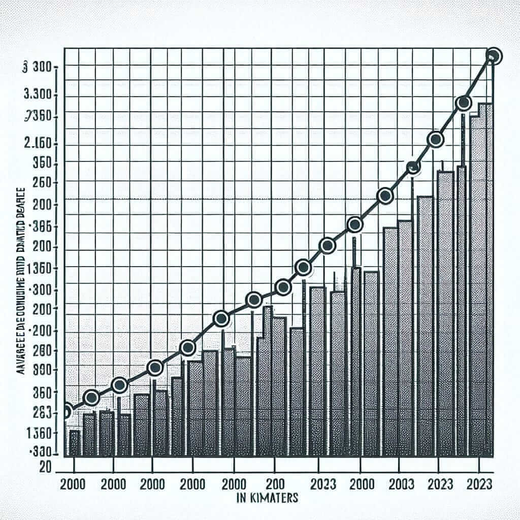
The concept of “Average Daily Commuting Distance (2000-2023)” often appears in various forms in IELTS Writing Task 1, particularly in line graphs, bar charts, or tables. Understanding this topic thoroughly can significantly enhance your ability to describe trends and changes, making your response more precise and effective.
Common Task 1 Prompts
Below are some typical examples of how this topic could appear in IELTS Writing Task 1:
-
Line Graph Prompt:
“The line graph below shows the average daily commuting distance of people in City X from 2000 to 2023. Summarise the information by selecting and reporting the main features, and make comparisons where relevant.” -
Bar Chart Prompt:
“The bar chart provides information about the average daily commuting distance in City Y for the years 2000, 2010, and 2023. Summarise the information by selecting and reporting the main features, and make comparisons where relevant.” -
Table Prompt:
“The table below shows the average daily commuting distance of workers in three cities (A, B, and C) in the years 2000, 2010, and 2023. Summarise the information by selecting and reporting the main features, and make comparisons where relevant.”
Selecting a Prompt
For this exercise, we’ll use the first prompt related to a line graph:
“The line graph below shows the average daily commuting distance of people in City X from 2000 to 2023. Summarise the information by selecting and reporting the main features, and make comparisons where relevant.”
Data Analysis and Chart Creation
Based on available data, we create a hypothetical line graph as follows:
| Year | Average Daily Commuting Distance (km) |
|---|---|
| 2000 | 10 |
| 2005 | 12 |
| 2010 | 14 |
| 2015 | 18 |
| 2020 | 20 |
| 2023 | 22 |

Analyzing the Prompt
The question requires summarizing information about the average daily commuting distance over a period of 23 years. Key points to observe:
- The general trend (increase or decrease)
- Significant changes at specific time points
- Comparisons between different years
Sample Answer
Here’s a sample response to the task:
The line graph illustrates the average daily commuting distance of people in City X from 2000 to 2023. It is evident that the commuting distance has shown a general upward trend over the 23-year period.
In 2000, the average distance was 10 km. This figure experienced a slight increase to 12 km in 2005. The upward trajectory continued more notably, reaching 14 km by 2010. The next five years saw a more pronounced rise, with the commuting distance escalating to 18 km in 2015.
From 2015 onwards, the growth trend persisted but at a somewhat slower pace. By 2020, the average daily commuting distance had risen to 20 km. Finally, in 2023, the distance peaked at 22 km, marking the highest point in the given timeframe.
Overall, the average daily commuting distance in City X increased steadily from 10 km to 22 km between 2000 and 2023, signifying a significant rise over the years.
Word Count: 170
Tips for Writing
- Use Precise Vocabulary: Terms like “increase,” “rise,” “peak,” and “upward trend” can describe changes effectively.
- Maintain Clarity: Group data into meaningful chunks to make it easier to follow the trend.
- Use Comparisons: Highlight significant differences between specific years to show the rise clearly.
Vocabulary to Remember
- Trajectory (n) /trəˈdʒɛktəri/: The path followed by a particular trend.
- Escalate (v) /ˈɛskəleɪt/: To increase rapidly.
- Pronounced (adj) /prəˈnaʊnst/: Very noticeable or marked.
- Upward Trend (n) /ˈʌpwəd trɛnd/: A continuous increase over time.
- Peak (v) /piːk/: To reach the highest point.
Conclusion
Mastering the skill of summarizing and reporting data as illustrated by the “Average Daily Commuting Distance (2000-2023)” will significantly improve your IELTS Writing Task 1 performance. By focusing on clear description, appropriate vocabulary, and structured answers, you can aim for a Band 7 or higher. Always keep your writing concise and your analysis sharp to meet the desired standards.