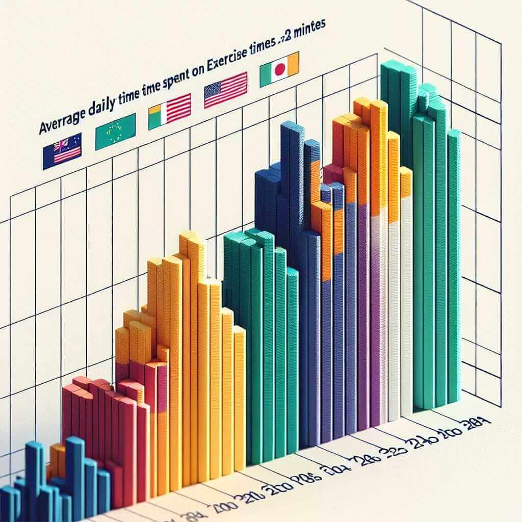
The average daily time spent on exercise is a topic that frequently appears in the IELTS Writing Task 1 section, especially in the form of line graphs, bar charts, or tables. This type of question tests your ability to interpret data, make comparisons, and discuss trends, which are crucial skills for achieving a high band score. This article provides a comprehensive guide to tackling questions related to “Average Daily Time Spent on Exercise in Various Countries (2000-2023)” and includes a sample task to help you practice.
Potential Task Examples
-
Bar Chart:
“The bar chart below shows the average daily time spent on exercise in four different countries from 2000 to 2023. Summarize the information by selecting and reporting the main features and make comparisons where relevant.” -
Line Graph:
“The line graph below illustrates the average daily time spent on exercise in five countries from 2000 to 2023. Summarize the information by selecting and reporting the main features and make comparisons where relevant.” -
Table:
“The table below displays the average daily time spent on exercise in various countries over the period from 2000 to 2023. Summarize the information by selecting and reporting the main features and make comparisons where relevant.”
Choosing a Task
For this article, let’s focus on the bar chart example:
Bar Chart Example
“The bar chart below shows the average daily time spent on exercise in four different countries from 2000 to 2023. Summarize the information by selecting and reporting the main features and make comparisons where relevant.”
Creating the Bar Chart
Based on available data, the bar chart might display information on countries like the USA, the UK, Australia, and Japan.
| Year | USA | UK | Australia | Japan |
|---|---|---|---|---|
| 2000 | 30 | 25 | 40 | 45 |
| 2005 | 32 | 27 | 42 | 46 |
| 2010 | 35 | 30 | 45 | 48 |
| 2015 | 37 | 32 | 48 | 50 |
| 2020 | 40 | 35 | 50 | 52 |
| 2023 | 42 | 37 | 52 | 55 |

Analyzing the Task
Before starting your essay, identify key trends and comparisons:
-
Trends:
- Increase in all countries: Each country shows a steady increase in the average daily time spent on exercise.
-
Comparative Insights:
- Highest Time: Japan consistently has the highest average daily exercise time.
- Lowest Increase: The UK has the lowest average but shows a significant increase over the period.
- Consistent Rise: All countries exhibit a consistent increase in exercise time.
Sample Writing Task
Based on the data and identified trends, here’s a possible response:
The bar chart illustrates the average daily time spent on exercise in four countries—USA, UK, Australia, and Japan—from 2000 to 2023. Overall, it is clear that the average daily exercise time has increased steadily in all four countries over the period.
In 2000, Japan had the highest average exercise time at 45 minutes per day, while the UK had the lowest at 25 minutes. By 2023, Japan’s average increased to 55 minutes, maintaining its position as the country with the highest exercise time throughout the period. Meanwhile, the USA and Australia also showed significant increases, rising from 30 and 40 minutes respectively in 2000 to 42 and 52 minutes per day in 2023. The UK’s exercise time, while consistently lower than the other countries, rose by 12 minutes, reaching 37 minutes in 2023.
Across the 23-year period, all countries exhibited a consistent upward trend in average daily exercise time. This indicates a growing awareness and participation in physical activities. The steady increase across all countries highlights a global trend towards more active lifestyles over these years.
Word Count: 178
Key Vocabulary and Grammar Tips
Vocabulary:
- Illustrates (v) – /ˈɪl.ə.streɪt/: to show the meaning or truth of something more clearly, especially by giving examples.
- Average (n) – /ˈæv.ər.ɪdʒ/: the result obtained by adding several quantities together and then dividing this total by the number of quantities.
- Increase (n/v) – /ɪnˈkriːs/: to become larger in amount or size.
- Consistently (adv) – /kənˈsɪs.tənt.li/: in every case or on every occasion; invariably.
- Exhibit (v) – /ɪɡˈzɪb.ɪt/: to show, make visible or apparent.
Grammar Tips:
-
Using Comparative and Superlative Adjectives:
- Example: “Japan has the highest average daily exercise time, while the UK has the lowest.”
-
Presenting Data Trends:
- Example: “By 2023, Japan’s average increased to 55 minutes, maintaining its position as the country with the highest exercise time.”
-
Linking Words for Comparisons:
- Use words like “while,” “whereas,” and “however” to compare and contrast data.
Conclusion
Understanding how to interpret and describe data presented in bar charts, line graphs, or tables is essential for IELTS Writing Task 1. By focusing on key trends and making insightful comparisons, you can craft a coherent and compelling response that meets the criteria for a high band score. Remember to use appropriate vocabulary, comparative structures, and clear organization to deliver an effective analysis.