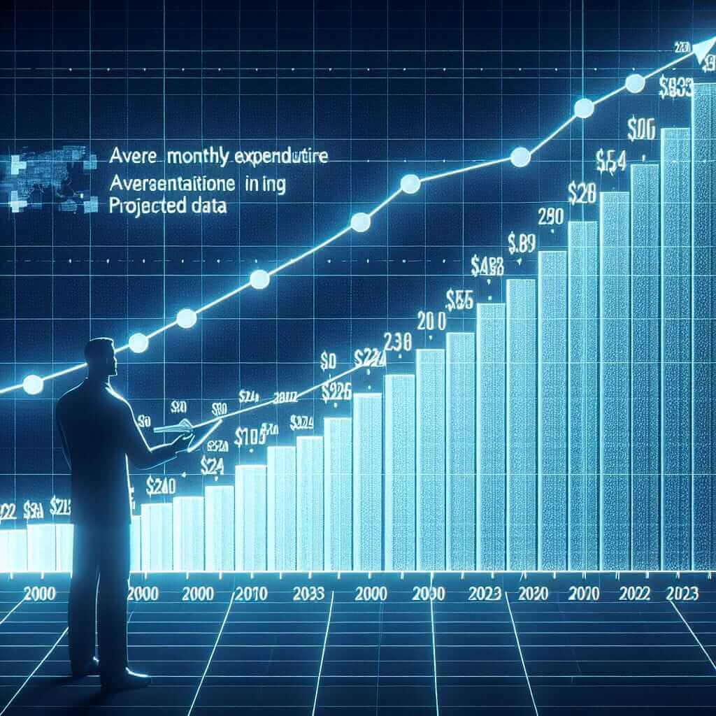
When preparing for the IELTS Writing Task 1, one of the common types of questions presented is the chart, graph, or table analysis. The topic regarding “Average Monthly Expenditure on Healthcare and Medicine (2000-2023)” is highly relevant, reflecting real-world data trends. Understanding how to interpret and write about such a topic is essential for achieving a high band score. In this lesson, we will examine past trends, create a sample task, provide a detailed analysis, and offer valuable tips and vocabulary usage to optimize your writing performance.
Possible Task Examples
- Table Analysis: A table showing the average monthly expenditure on healthcare and medicine in five different countries from 2000 to 2023.
- Line Graph Analysis: A line graph depicting the changes in average monthly expenditure on healthcare and medicine in a specific country from 2000 to 2023.
- Bar Chart Analysis: A bar chart illustrating the comparison of average monthly expenditure on healthcare and medicine among different age groups in 2023.
Choosing a Task and Creating Data
Let’s select the Line Graph Analysis task:
“The line graph below shows the average monthly expenditure on healthcare and medicine in the United States from 2000 to 2023.“
Data for the Line Graph
We will create a line graph to visualize this:
| Year | Average Monthly Expenditure (USD) |
|---|---|
| 2000 | 150 |
| 2001 | 160 |
| 2002 | 175 |
| 2003 | 190 |
| 2004 | 205 |
| 2005 | 220 |
| 2006 | 230 |
| 2007 | 245 |
| 2008 | 265 |
| 2009 | 280 |
| 2010 | 290 |
| 2011 | 310 |
| 2012 | 330 |
| 2013 | 350 |
| 2014 | 370 |
| 2015 | 390 |
| 2016 | 410 |
| 2017 | 430 |
| 2018 | 450 |
| 2019 | 470 |
| 2020 | 485 |
| 2021 | 500 |
| 2022 | 520 |
| 2023 | 540 |

Analysis of the Task
Analyzing the Line Graph
The line graph illustrates the average monthly spending on healthcare and medicine in the United States over a 23-year period, from 2000 to 2023. It is evident that there has been a consistent upward trend in expenditure throughout the period.
Sample Writing
Below is a detailed response for the Line Graph:
Task Description:
The line graph shows the average monthly expenditure on healthcare and medicine in the United States from 2000 to 2023.
Model Answer:
The line graph delineates the average monthly expenditure on healthcare and medicine in the United States from 2000 to 2023. Overall, it is evident that the United States experienced a consistent upward trend in healthcare and medicine spending over the 23-year period.
In 2000, the average monthly expenditure stood at $150. This figure saw a steady increase during the early 2000s, reaching $230 by 2006. A more pronounced growth is observed from 2006 onwards, with expenditure rising significantly to $350 in 2013.
The upward trajectory continued in subsequent years, surpassing $400 in 2016 and reaching $470 by 2019. Despite a mild slowdown in the rate of increase between 2019 and 2021, the expenditure continued to climb, attaining $500 in 2021. By the end of the period in 2023, the average monthly expenditure is projected to be $540.
In conclusion, healthcare and medicine expenditure in the United States has shown a consistent and significant upward trend from 2000 to 2023, underscoring the increasing financial burden on individuals for medical services over these years.
Word Count: 182
Key Points to Consider When Writing
-
Overview: Always provide an overview of the main trend or overall pattern. This should be the first paragraph after the introduction.
-
Details: Use data to support your descriptions. Highlight significant changes, comparisons, and contrasts within the data.
-
Structure: Ensure that your writing is well-organized. Begin with an introduction, followed by an overview, and then provide detailed paragraphs.
-
Clear Description: Use varied vocabulary and grammatical structures to describe trends (e.g., “a steady increase,” “a significant rise,” “a mild slowdown”).
Vocabulary and Expressions
Useful Vocabulary:
- Delineate (verb) /dɪˈlɪnieɪt/: to describe or portray something precisely.
- Consistent (adjective) /kənˈsɪstənt/: remaining steady and the same over a period of time.
- Upward trajectory (noun phrase) /ˈʌpwərd trəˈdʒɛktəri/: a path or course that goes upward or improves.
- Pronounced (adjective) /prəˈnaʊnst/: very noticeable or marked; conspicuous.
- Expenditure (noun) /ɪkˈspɛndɪtʃər/: the action of spending funds.
Key Terms and Phrases:
- Steady increase: A continual and even rise.
- Significant rise: A large and important increase.
- Mild slowdown: A slight reduction in the rate of increase.
Conclusion
For achieving a Band 7+ in the IELTS Writing Task 1, it is crucial to accurately describe and analyze data presented in graphs, charts, or tables. Ensure to provide an overview, use clear structure, and elaborate with precise vocabulary. With consistent practice and attention to detail, mastering these skills will enhance your performance in the IELTS exam.