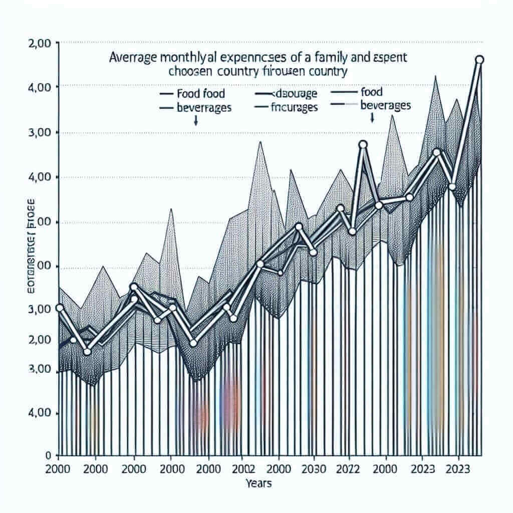
The topic of “Average Monthly Spending on Food and Beverages (2000-2023)” is highly relevant in the context of IELTS Writing Task 1, which often requires candidates to describe trends in data presented in graphs, tables, or charts. In this article, we will discuss the importance of this topic, examine some historical data, and provide a sample task based on this theme. Understanding how to structure and analyze such data is crucial for achieving a high score in the IELTS Writing Task 1.
Sample Task 1:
You should spend about 20 minutes on this task.
The graph below shows the average monthly spending on food and beverages by a family in Country X from 2000 to 2023.
Summarize the information by selecting and reporting the main features, and make comparisons where relevant.
Write at least 150 words.

Main Content
Analyzing the Task
In this example, the task involves describing and analyzing a line graph showing the average monthly spending on food and beverages over a span of 23 years. It is important to note trends, changes, and any noticeable features in the data.
Understanding the Data
Before writing your response, thoroughly examine the graph. Look for elements such as:
- Overall Trend: Is the spending increasing, decreasing, or remaining stable?
- Key Points: Identify the highest and lowest points, significant increases or decreases, and any periods of stability.
- Comparisons: Compare different years or periods that exhibit noticeable differences.
Writing a Sample Answer
Introduction
Begin with a brief introduction to the graph. Mention what it depicts, covering the timeframe and the subject.
Overview
Provide an overview of the main trends without getting into too much detail. This should summarize the most important aspects of the data.
Details
Break down the data into smaller segments. Discuss specific years, changes, and the differences noted. Ensure you compare and contrast where relevant.
Sample Answer
Introduction
The line graph illustrates the average monthly expenditure on food and beverages by a typical family in Country X from 2000 to 2023.
Overview
Overall, the graph indicates an upward trend in spending over the period, with several fluctuations. The most significant increases were observed after the year 2010, reaching a peak in recent years.
Details
In 2000, the average monthly spending was approximately $200. Over the next decade, the expenditure increased gradually, peaking at $300 in 2010. Following a brief period of stability, there was a sharp rise between 2010 and 2015, reaching around $450. Post-2015, the spending continued to grow but at a slower pace, eventually leveling off at roughly $500 at the end of the period in 2023.
Several notable fluctuations occurred within this timeframe. Between 2008 and 2010, there was a significant increase, which contrasts sharply with the relative stability observed from 2000 to 2008. Post-2015, the growth rate diminished compared to the rapid increase of the previous five years, indicating a stabilization of spending habits.
Word Count: 178
Key Points to Remember
- Structure: Ensure your response has a clear structure—introduction, overview, and detailed analysis.
- Comparisons: Highlight and compare notable points within the data.
- Accuracy: Always describe the data accurately based on the provided chart or graph.
- Conciseness: Be concise but thorough. Every sentence should add value to your analysis.
Vocabulary and Grammar
Useful Vocabulary
- Expenditure (noun) /ɪkˈspendɪtʃə/: The action of spending funds.
- Example: The government’s expenditure on healthcare has increased.
- Fluctuation (noun) /ˌflʌktʃuˈeɪʃən/: An irregular rising and falling in number or amount.
- Example: Fluctuations in temperature are common in this region.
- Stability (noun) /stəˈbɪlɪti/: The state of being stable.
- Example: The stability of the economy has been maintained.
- Increment (noun) /ˈɪnkrɪm(ə)nt/: An increase or addition, especially one of a series on a fixed scale.
- Example: He added to his savings in small increments.
- Peak (noun) /piːk/: The highest point in a specified value or activity.
- Example: Tourism hits its peak in summer.
Key Grammar Points
- Tenses: Use appropriate tenses to describe trends (e.g., past simple, present perfect).
- Comparative Structures: Learn to use comparative structures effectively (e.g., “higher than,” “as… as,” “more/less than”) for making comparisons.
- Linking Words: Use linking words to connect ideas smoothly (e.g., “however,” “therefore,” “in addition”).
Conclusion
Describing data trends like the average monthly spending on food and beverages over the years requires a clear understanding of how to interpret graphs and charts. By structuring your response effectively, using relevant vocabulary, and ensuring grammatical accuracy, you can aim for a high band score in the IELTS Writing Task 1. Practice analyzing various types of data and remember to highlight key trends and comparisons.