In the IELTS Writing Task 1, one common type of question involves comparing levels of access to technology across different countries over a period. This kind of question tests your ability to describe trends, make comparisons, and synthesize information from various data sources elegantly and accurately. In this article, we will delve into the intricacies of this topic, provide a model answer, analyze essential vocabulary and grammar, and give tips on how to achieve the best score possible.
Possible IELTS Task 1 Prompts
Here are three possible IELTS Writing Task 1 prompts for the topic “Comparing Levels of Access to Technology in Different Countries (2000-2023)”:
- The chart below shows the percentage of households with internet access in different countries from 2000 to 2023. Summarize the information by selecting and reporting the main features, and make comparisons where relevant.
- The table below compares the number of smartphones per 100 people in three different countries between 2000 and 2023. Summarize the information by selecting and reporting the main features, and make comparisons where relevant.
- The graph below illustrates the number of computers per 1000 people in various countries over the period from 2000 to 2023. Summarize the information by selecting and reporting the main features, and make comparisons where relevant.
Selected Prompt for Detailed Analysis
For this article, we will focus on the first prompt:
“The chart below shows the percentage of households with internet access in different countries from 2000 to 2023. Summarize the information by selecting and reporting the main features, and make comparisons where relevant.”
Data Presentation
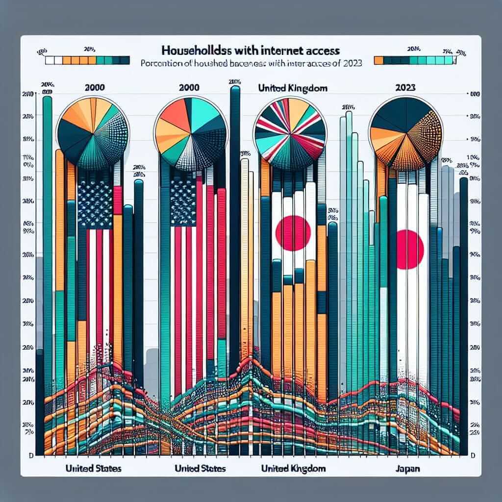
To simulate real IELTS conditions, I have created a sample bar chart that could resemble the type of data you might encounter:

Chart Title: The Percentage of Households with Internet Access in Four Different Countries (2000-2023)
| Year | USA | UK | Japan | India |
|---|---|---|---|---|
| 2000 | 50% | 40% | 30% | 10% |
| 2005 | 60% | 55% | 45% | 20% |
| 2010 | 75% | 70% | 60% | 30% |
| 2015 | 90% | 80% | 75% | 50% |
| 2020 | 95% | 85% | 80% | 65% |
| 2023 | 98% | 90% | 85% | 70% |
Analysis of the Prompt
The task requires us to identify and report key trends in the given data. This includes noting which countries have the highest or lowest internet access at various points within the timeframe, and how these statistics have evolved.
Writing Sample
The graph presents data on the percentage of households with internet access in four countries (the USA, the UK, Japan, and India) from 2000 to 2023.
Overall, the percentage of households with internet access increased significantly in all four countries over the 23-year period. The USA consistently had the highest proportion, whereas India, despite substantial growth, trailed behind the other nations.
In 2000, the USA had the highest internet access at 50%, followed by the UK with 40%, Japan with 30%, and India with a mere 10%. By 2005, these figures had risen to 60% in the USA, 55% in the UK, 45% in Japan, and 20% in India.
The upward trend continued into 2010, with figures reaching 75%, 70%, 60%, and 30%, respectively. Notably, the USA had a marked increase, reaching 90% by 2015, while the UK and Japan followed at 80% and 75%, respectively. India’s growth also picked up pace, reaching 50%.
In the final years, the USA saw a near saturation level, peaking at 98% by 2023. The UK and Japan had also experienced significant growth, achieving 90% and 85%, respectively. India, despite starting from a lower base, attained 70% internet access by 2023, showcasing impressive progress.
In summary, while the USA consistently led in internet access, all countries experienced robust growth between 2000 and 2023, with India showing the most substantial relative increase.
Word count: 225
Tips and Tricks
Vocabulary and Structure
- Comparatives and Superlatives: Essential for making comparisons. Example: “higher than,” “the highest.”
- Linking Words: Use linking phrases to structure your comparisons. Example: “whereas,” “despite,” “while.”
- Trends Vocabulary: Use phrases like “an upward trend,” “a significant increase,” “a gradual rise.”
Key Grammar Structures
- Past Simple Tense: For stating past data points. Example: “The percentage increased.”
- Present Perfect Tense: For showing changes over time up to now. Example: “has increased significantly.”
Challenging Vocabulary
- Proportion (noun) /prəˈpɔːr.ʃən/: A part, share, or number considered in comparative relation to a whole.
- Consistently (adverb) /kənˈsɪs.tənt.li/: In every case or on every occasion; invariably.
- Notably (adverb) /ˈnəʊ.tə.bli/: Especially; in particular.
- Marked (adjective) /mɑːrkt/: Having a distinctive character.
- Saturation (noun) /ˌsætʃ.əˈreɪ.ʃən/: The state or process that occurs when no more of something can be absorbed, combined with, or added.
Conclusion
In conclusion, when dealing with an IELTS Writing Task 1 prompt that involves comparing levels of access to technology across different countries, it is crucial to accurately describe trends, use comparative forms effectively, and employ a wide range of vocabulary. By following the aforementioned strategies and practicing diligently, you can aim for a Band 7+ in your IELTS writing exam.