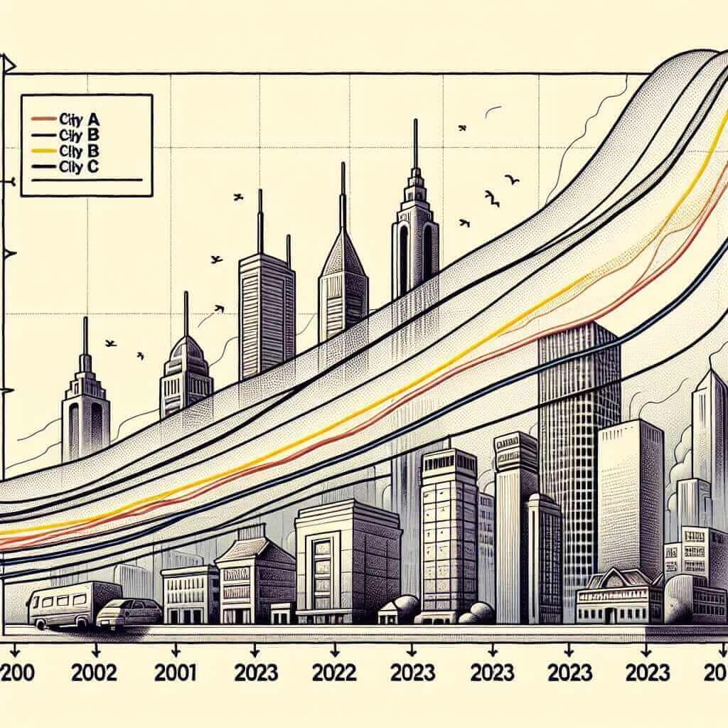
Comparing air quality levels over time and across various regions is a common subject for IELTS Writing Task 1. This type of task requires you to accurately describe and compare data presented in a graph, chart, or table. In this article, we’ll delve into the intricacies of this task, provide a sample question and response, and give you some important tips and vocabulary to help you achieve a Band 7+ score.
Sample Questions
Here are a few IELTS Writing Task 1 sample questions related to comparing levels of air quality in different regions:
-
The line chart below shows the levels of air pollution in four different cities from 2000 to 2023. Summarize the information by selecting and reporting the main features, and make comparisons where relevant.
-
The table below provides data on the air quality index (AQI) in three regions over a period of time (2000-2023). Summarize the information by selecting and reporting the main features, and make comparisons where relevant.
-
The bar chart below illustrates the average levels of air particulates (PM2.5) in urban and rural areas in five different countries between 2000 and 2023. Summarize the information by selecting and reporting the main features, and make comparisons where relevant.
Choosing a Sample Question
Let’s choose the first sample question to create a detailed response:
The line chart below shows the levels of air pollution in four different cities from 2000 to 2023. Summarize the information by selecting and reporting the main features, and make comparisons where relevant.
Creating a Line Chart
To approach this task, we first need to visualize a line chart. Let’s consider the following hypothetical data:
| Year | City A | City B | City C | City D |
|---|---|---|---|---|
| 2000 | 70 | 55 | 40 | 65 |
| 2005 | 60 | 50 | 42 | 60 |
| 2010 | 55 | 45 | 45 | 55 |
| 2015 | 50 | 40 | 47 | 50 |
| 2020 | 45 | 38 | 49 | 45 |
| 2023 | 40 | 35 | 50 | 40 |

Analyzing the Question
This line chart provides data on air pollution levels in four cities over a span of 23 years. We need to summarize the main features and make relevant comparisons.
Sample Response
The line chart illustrates the levels of air pollution in four cities—City A, City B, City C, and City D—from the year 2000 to 2023.
Overall, it can be observed that air pollution levels in all cities have shown a declining trend over the specified period. However, the rates of decline and the pollution levels vary among the cities.
In City A, air pollution levels started at 70 in 2000 and steadily decreased to reach 40 by 2023. Similarly, City B saw a reduction from 55 to 35 over the same period. Both cities experienced a gradual decline without any significant fluctuations, suggesting effective measures were consistently applied.
Conversely, City C had a slight increase in pollution levels from 40 in 2000 to 42 by 2005. After a slight increase, pollution levels continued to rise, peaking at 50 in 2023. This indicates that City C faced challenges in maintaining a downward trend in air pollution.
City D followed a pattern similar to Cities A and B but began at a higher pollution level of 65 in 2000. By 2023, City D managed to reduce its pollution levels to 40, despite some fluctuations in the interim years.
In conclusion, while Cities A and B consistently reduced air pollution over the years, City C experienced an overall increase. City D also succeeded in lowering its pollution levels but not as consistently as Cities A and B.
Word Count: 217
Key Tips for Writing Task 1
Vocabulary and Grammar Tips
-
Trend-related Vocabulary: Use terms like “increase,” “decrease,” “rise,” “fall,” “remain stable,” “fluctuate,” etc.
- Example: “Air pollution levels in City A decreased steadily from 70 to 40.”
-
Comparative Structures:
- Use comparative forms to highlight differences.
- Example: “City A’s levels declined more sharply compared to City B.”
- Use superlative forms to show extremes.
- Example: “City C had the highest increase in pollution levels.”
- Use comparative forms to highlight differences.
-
Complex Sentences: Combine information using conjunctions and relative clauses for better coherence.
- Example: “While City A and B consistently reduced their pollution levels, City C, which initially had better air quality, saw an upward trend.”
Common Vocabulary for Describing Air Quality
- Pollution Level (noun) [pəˈluːʃ(ə)n lev(ə)l]: The concentration of pollutants in the air.
- Fluctuate (verb) [ˈflʌktʃueɪt]: To rise and fall irregularly.
- Steady (adjective) [ˈstedi]: Gradually increasing or decreasing.
- AQI (noun) [eɪ kjuː aɪ]: Air Quality Index, a measure used to communicate how polluted the air currently is.
- Urban (adjective) [ˈərbən]: Relating to a city or town.
- Rural (adjective) [ˈrʊrəl]: Relating to the countryside.
- Particulates (noun) [pərˈtɪkjuləts]: Tiny particles or droplets in the air.
- Decline (verb) [dɪˈklaɪn]: To decrease.
- Trend (noun) [trɛnd]: A general direction in which something is developing or changing.
- Level off (phrasal verb) [ˈlɛvəl ɒf]: To stop increasing or decreasing.
Conclusion
In conclusion, when tackling IELTS Writing Task 1 questions involving air quality comparisons, ensure clarity in data presentation, use varied and accurate vocabulary, and construct complex sentences for better coherence and cohesion. By following these guidelines, you can better describe trends and comparisons, aiming for a score of Band 7 or higher.