Understanding the dynamics of public health expenditure can provide deep insights into a country’s prioritization of healthcare, economic resilience, and overall well-being of its citizens. For IELTS Writing Task 1, you may be presented with data regarding public health expenditures across different countries over a given period. This article guides you through mastering such topics, ensuring you can write sophisticated, high-scoring responses.
Common IELTS Task 1 Prompts Related to Public Health Expenditure
When preparing for the IELTS Writing Task 1, it’s essential to familiarize yourself with various ways data might be presented to you, such as tables, bar charts, line graphs, and pie charts. Here are some sample prompts related to healthcare spending:
- Prompt 1: The following graph shows public health expenditure as a percentage of GDP in four different countries from 2000 to 2023. Summarize the information by selecting and reporting the main features and make comparisons where relevant.
- Prompt 2: The table below shows the per capita public health expenditure in USD for five countries from 2000 to 2023. Summarize the information by selecting and reporting the main features and make comparisons where relevant.
- Prompt 3: The pie charts below show the breakdown of public health expenditure by various categories (hospital services, preventive care, pharmaceuticals, etc.) in three countries in 2000 and 2023. Summarize the information by selecting and reporting the main features and make comparisons where relevant.
In this article, we will focus on Prompt 1 and guide you through crafting a high-quality response.
Creating Data (Based on Prompt 1)
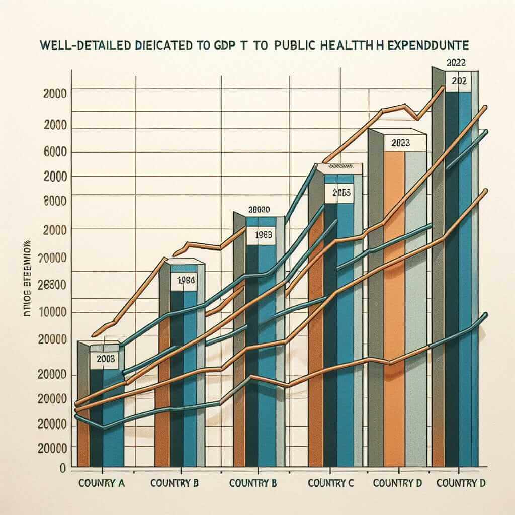
To assist with our analysis, let’s create a hypothetical line graph dataset showing public health expenditure as a percentage of GDP for four countries: Country A, Country B, Country C, and Country D.
Hypothetical Data:
| Year | Country A | Country B | Country C | Country D |
|---|---|---|---|---|
| 2000 | 4% | 5% | 3% | 6% |
| 2005 | 4.5% | 5.5% | 3.5% | 6.5% |
| 2010 | 5% | 6% | 4% | 7% |
| 2015 | 5.5% | 6.5% | 4.5% | 7.5% |
| 2020 | 6% | 7% | 5% | 8% |
| 2023 | 6.5% | 7.5% | 5.5% | 8.5% |

Analyzing the Graph
Step-by-Step Breakdown:
- Introduction: Paraphrase the prompt. Mention the time frame, the parameters, and the countries involved.
- Overview: Summarize the primary trends without details. Highlight the most noticeable trends such as the general increase in expenditure.
- Details: Describe the data in detail. Make comparisons between the countries, specifying the increments and peak values. Be careful to evenly distribute your attention to all data points.
Writing Task 1 Sample Response
Introduction
The line graph illustrates the percentage of GDP allocated for public health expenditure in four different countries (Country A, Country B, Country C, and Country D) over the period from 2000 to 2023.
Overview
Overall, the data reflects a consistent upward trend in public health expenditure as a percentage of GDP across all four countries. Country D consistently recorded the highest percentages throughout the given period, while Country C showed the lowest values. All countries experienced an increase in health expenditure over the 23 years.
Detailed Analysis
In 2000, Country D had the highest public health expenditure at 6% of GDP, whereas Country C had the lowest at 3%. By 2005, all countries experienced slight increases, with Country D rising by 0.5% to 6.5%, and Country C by the same margin to 3.5%.
A steady upward trend continued for all nations. By 2010, Country A had increased its health expenditure to 5%, while Country B and Country C had reached 6% and 4% respectively. Country D topped the chart with a 7% expenditure rate.
By 2020, significant increments were observed. Country A’s expenditure reached 6%, while Country B’s grew to 7%. Country C, although behind, increased its expenditure to 5%, and Country D continued leading with 8%.
In the final year of observation, 2023, all countries showed their highest health expenditures. Country A rose to 6.5%, and Country B to 7.5%. Country C and Country D peaked at 5.5% and 8.5% respectively.
Word Count
This report contains 215 words.
Notes on Vocabulary and Grammar
Essential Vocabulary for Public Health Expenditure Topics
- Expenditure (n): /ɪksˈpendɪtʃər/ – the act of spending money.
- Increment (n): /ˈɪŋkrəmənt/ – an increase or addition.
- Allocate (v): /ˈæləˌkeɪt/ – to distribute or assign resources.
- Consistent (adj): /kənˈsɪstənt/ – not changing in nature, standard, or effect over time.
- Upward trend (n): /ˈʌpwərd trɛnd/ – a general increase in a particular measure over time.
Grammatical Pointers
- Comparatives and Superlatives: “higher than”, “the highest”
- Past Simple and Present Perfect: “showed an increase”, “has risen”
- Passive Voice: “was recorded”, “is allocated”
Conclusion
When faced with tasks involving data on public health expenditures, it is crucial to identify trends, compare data points effectively, and use precise vocabulary and grammar. This approach ensures a coherent and well-organized response that addresses the prompt thoroughly, much like the one we have analyzed. Practicing such tasks meticulously prepares you for a high band score in the IELTS Writing Task 1.