When preparing for the IELTS Writing Task 1, it’s crucial to understand how to analyze and report on data. One recurring topic is comparing public transport usage across different cities over a period of time. This topic is relevant due to urbanization and increasing concerns about environmental sustainability. In this lesson, we will delve into how you can effectively tackle such a report, providing a detailed example, vocabulary, and grammatical nuances to watch out for.
Here are a few sample tasks that could appear in the IELTS exam:
- The line graph below shows the levels of public transport usage in three different cities from 2000 to 2023. Summarize the information by selecting and reporting the main features, and make comparisons where relevant.
- The bar chart illustrates the percentage of people using public transport in five different cities between 2000 and 2023. Summarize the information by selecting and reporting the main features, and make comparisons where relevant.
- The table provides data about the public transport usage in different cities from 2000 to 2023. Summarize the information by selecting and reporting the main features, and make comparisons where relevant.
For today’s lesson, we will select the first sample task to create a model answer.
Analyzing the Task
First, let’s consider our example and break down the task:
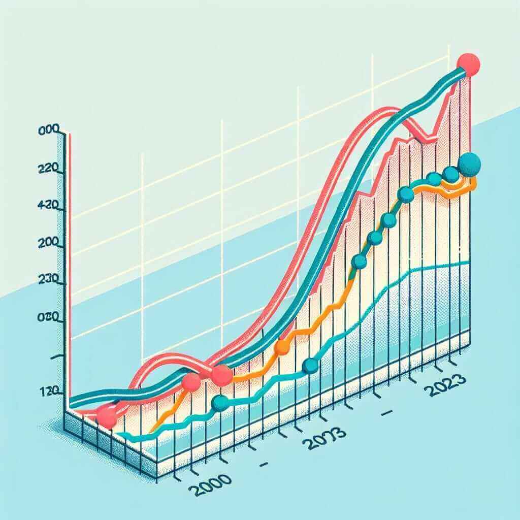
Task: The line graph below shows the levels of public transport usage in three different cities from 2000 to 2023. Summarize the information by selecting and reporting the main features, and make comparisons where relevant.
Here is a representation of the data:

Key Points to Note
- Identify the cities involved.
- Note the time period: 2000 to 2023.
- Highlight significant trends and changes.
- Compare the public transport usage across the cities.
Model Answer
Below is a model answer for this task:
The line graph illustrates the levels of public transport usage in three distinct cities—City A, City B, and City C—over a period of 23 years, from 2000 to 2023.
Overall, it is evident that City A experienced a steady increase in public transport usage, whereas City B saw a significant fluctuation. Conversely, City C demonstrated a declining trend throughout the period.
In 2000, the public transport usage in City A stood at 20 million, showing a progressive rise to 50 million by 2013. After this point, there was a dramatic increase reaching 80 million in 2023. Similarly, City B began at approximately 30 million users in 2000, but this figure experienced significant variations, peaking at around 60 million in 2008 before markedly decreasing to 40 million by 2023.
Meanwhile, City C showed a contrasting pattern. Starting at 70 million in 2000, its public transport usage constantly declined to reach around 30 million by the end of the term. Between 2018 and 2023, however, the figures plateaued.
In conclusion, this graph reveals a clear upward trend in City A’s public transport use, substantial volatility in City B, and a consistent decrease in City C’s numbers.
Word Count: 189
Vocabulary and Grammar Tips
Vocabulary
- Illustrate (verb) /ˈɪl.ə.streɪt/: to explain or make something clear. E.g., “The line graph illustrates the levels of public transport usage.”
- Fluctuation (noun) /ˌflʌk.tʃuˈeɪ.ʃən/: variation or changes. E.g., “City B saw significant fluctuation in public transport usage.”
- Dramatic (adjective) /drəˈmæt.ɪk/: sudden and striking. E.g., “There was a dramatic increase in public transport usage.”
- Plateau (verb) /ˈplæt.əʊ/: to reach a state of little or no change after a time of activity or progress. E.g., “The figures plateaued between 2018 and 2023.”
- Contrasting (adjective) /ˈkɒn.træstɪŋ/: differing strikingly. E.g., “City C showed a contrasting pattern.”
Grammar
- Tenses: Use the correct tenses to describe past actions and trends. For example, “saw,” “declined,” “rose,” “reached.”
- Comparatives and Superlatives: Useful when comparing data. E.g., “higher than,” “the most significant.”
- Linking Words: Essential for coherence and cohesion in your essay. E.g., “whereas,” “conversely,” “meanwhile.”
Conclusion
When writing about comparing levels of public transport usage in different cities from 2000 to 2023, focus on identifying key trends and data points. Use varied sentence structures and a mix of tenses to describe these trends effectively. Always ensure your writing is coherent, cohesive, and utilizes appropriate vocabulary and grammar points.
For more tips and sample essays, check out Comparing Levels of Public Transportation Usage in Different Cities (2000-2023).
By adhering to these guidelines and practicing regularly, you can aim for a Band 7+ in your IELTS Writing Task 1.