When preparing for the IELTS writing task 1, candidates often encounter tasks that require them to compare data across different categories over time. Data involving renewable energy usage in different countries from 2000 to 2023 is a pertinent topic given the global push toward sustainability. This article provides a detailed analysis of comparing renewable energy usage levels across various countries, offering insights into vocabulary, grammar, and strategies necessary for achieving a high band score.
Sample IELTS Writing Task 1 Questions
-
Sample Task 1:
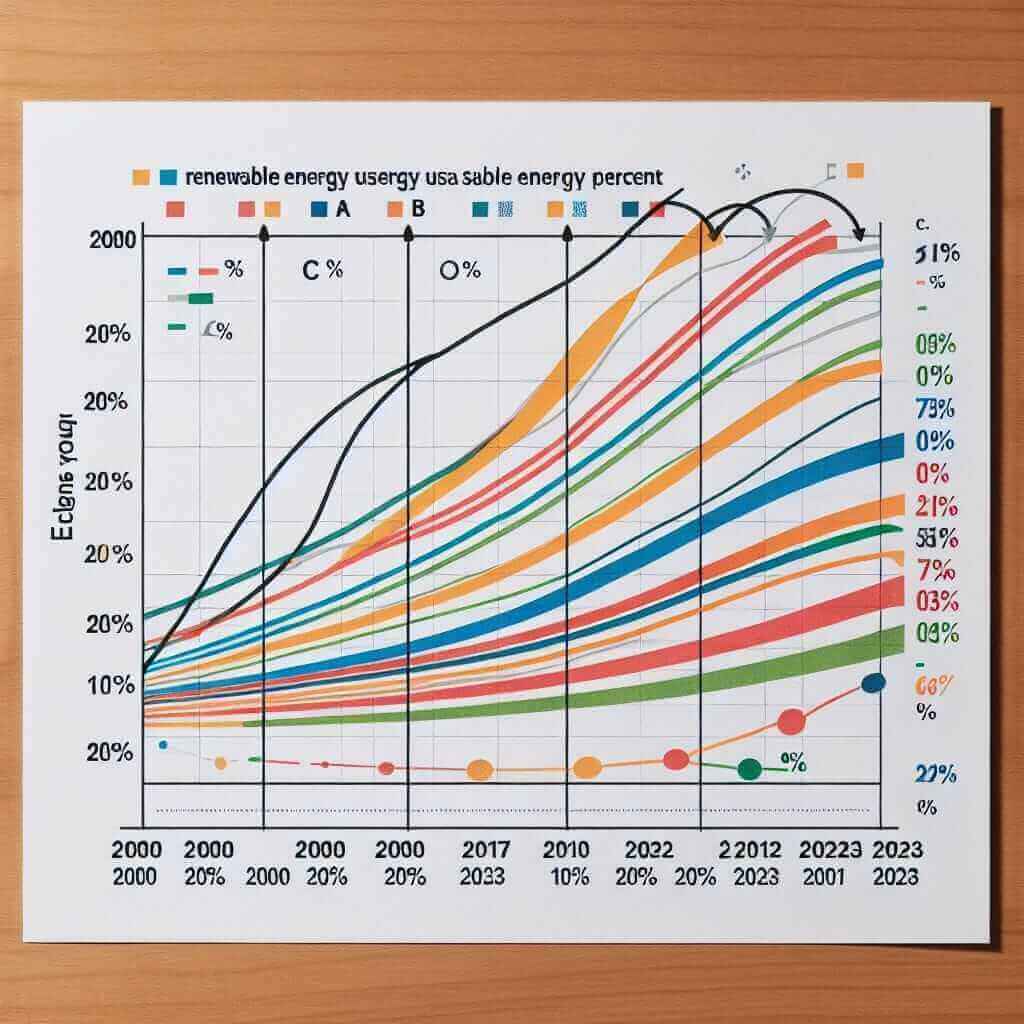
“The line graph below shows the percentage of renewable energy usage in four countries (A, B, C, and D) from 2000 to 2023. Summarise the information by selecting and reporting the main features and make comparisons where relevant.” -
Sample Task 2:
“The bar chart compares renewable energy consumption in five countries in 2000, 2010, and 2023. Summarise the information by selecting and reporting the main features and make comparisons where relevant.” -
Sample Task 3:
“The table illustrates the amount of renewable energy generated (in Terawatt-hours) by three different countries in 2000, 2010, and 2023. Summarise the information by selecting and reporting the main features and make comparisons where relevant.”
Example Data Table for Task 1 Analysis
| Year | Country A (%) | Country B (%) | Country C (%) | Country D (%) |
|---|---|---|---|---|
| 2000 | 10 | 5 | 15 | 8 |
| 2010 | 20 | 15 | 25 | 18 |
| 2023 | 40 | 30 | 45 | 38 |
Selecting the Sample Task for Detailed Analysis
Let’s choose the first sample task: “The line graph below shows the percentage of renewable energy usage in four countries (A, B, C, and D) from 2000 to 2023. Summarise the information by selecting and reporting the main features and make comparisons where relevant.”
 Renewable Energy Usage Line Graph
Data Interpretation and Analysis
First, examine the data to identify key trends and comparisons:
- Country A shows a significant increase from 10% in 2000 to 40% in 2023.
- Country B also demonstrates noticeable growth, quadrupling its usage from 5% to 30%.
- Country C starts with a high percentage (15%) and sees a threefold increase to 45%.
- Country D exhibits steady growth from 8% to 38%.
Sample Writing Task 1 Response
The line graph illustrates the percentages of renewable energy usage in four different countries (A, B, C, and D) between 2000 and 2023. Overall, all four countries experienced upward trends in their renewable energy usage over the period.
In 2000, Country A began with 10% of its energy sourced from renewable resources, which increased gradually to reach 20% by 2010. The most significant rise occurred between 2010 and 2023, with the percentage doubling to 40%. Similarly, Country B, starting from a lower base of 5%, quadrupled its renewable usage to 30% by 2023, with the majority of this growth occurring after 2010.
Country C, which initially had one of the highest proportions at 15%, saw steady increases throughout the period, reaching 25% in 2010 and further to 45% in 2023, overtaking Country A by the end of the period. Country D exhibited a more gradual increase compared to the other countries, rising from 8% in 2000 to 18% in 2010 and finally to 38% in 2023.
Notably, Country C consistently maintained the highest level of renewable energy usage from 2010 onwards, while Country B, despite starting the lowest, achieved significant gains, illustrating diverse growth patterns among the countries.
Word count: 203 words
Key Considerations for Writing
- Identify Trends: Clearly outline the overall trend observed in the data. For example, all countries show increased renewable energy usage.
- Compare Figures: Highlight specific figures when comparing different countries or time periods. This demonstrates careful analysis of the data.
- Use Comparative Language: Employ phrases like “compared to,” “while,” “whereas,” and “in contrast” to effectively make comparisons.
- Maintain Accuracy: Ensure numerical data and key details are accurately described to maintain credibility.
- Coherence and Cohesion: Use linking words and varied sentence structures to maintain the flow of your analysis.
Critical Vocabulary and Usage
- Significant (adj.) /ˈsɪɡ.nɪ.fɪ.kənt/: Meaningful or important change.
- Example: “There was a significant increase in renewable energy usage in Country A.”
- Proportion (n.) /prəˈpɔːr.ʃən/: Part or share of the whole.
- Example: “The proportion of energy sourced from renewables increased.”
- Triple (v.) /ˈtrɪp.l/: To grow threefold.
- Example: “The renewable energy consumption in Country C tripled.”
- Gradual (adj.) /ˈɡrædʒ.u.əl/: Happening slowly over a period of time.
- Example: “There was a gradual rise in energy usage.”
- Overtake (v.) /ˌoʊ.vɚˈteɪk/: To surpass someone or something.
- Example: “Country C eventually overtook Country A in renewable energy usage.”
Conclusion
To excel in IELTS writing task 1, particularly when tasked with comparing levels of renewable energy usage, it’s crucial to practice analyzing data, identifying trends, making comparisons, and utilizing precise vocabulary. By applying these strategies, candidates can confidently discuss various data sets and achieve high band scores.


