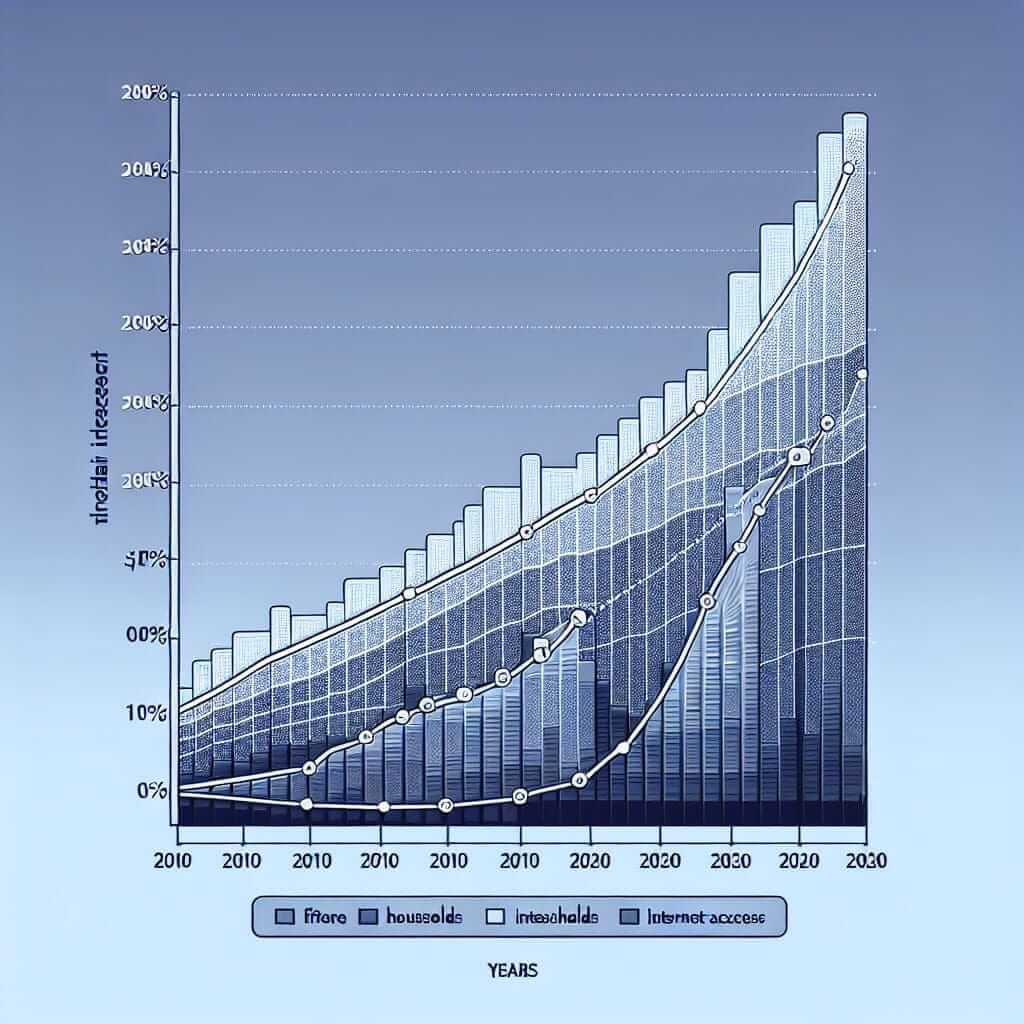
In the IELTS Writing Task 1 (Academic), you’ll be presented with visual data in the form of a graph, chart, table, map, or a combination of these. Your task is to write a report summarizing the key features and making comparisons where relevant. This requires strong analytical skills to interpret the data accurately and effectively. Failing to analyze the data properly can lead to misinterpretations, inaccurate summaries, and ultimately, a lower score.
Breaking Down the Analysis Process
Analyzing data for IELTS Writing Task 1 involves several key steps:
1. Identify the Visual Data Type and its Purpose
- Type: Is it a line graph, bar chart, pie chart, table, map, or a process diagram?
- Purpose: What information is the visual trying to convey? What trends, changes, or comparisons are being highlighted?
Example:
Let’s say you’re given a line graph titled “Average Monthly Temperatures in London and Sydney”. The purpose of this graph is to show the temperature fluctuations in these two cities over a year and highlight the differences in their climates.
2. Identify Key Features and Trends
Carefully examine the data to pinpoint:
- Highest and lowest points: Where do the peaks and valleys lie?
- Trends over time: Are there any increases, decreases, fluctuations, or stable periods?
- Significant differences: If comparing data sets, what are the major contrasts or similarities?
Example (Continuing the previous example):
- Highest point: Sydney’s temperature peaks in January and February.
- Lowest point: London’s temperature is lowest in December and January.
- Trends: Both cities experience opposite seasons, with Sydney being warmer during London’s winter and vice-versa.
- Significant differences: Sydney generally has warmer temperatures than London throughout the year.
3. Group Information Logically
Organize the information into logical paragraphs based on:
- Similarities and differences: Group similar trends or contrasting features together.
- Chronological order: If applicable, present data in the order it occurs.
- Importance: Start with the most significant trends or features first.
4. Use Appropriate Vocabulary and Grammar
Employ a range of vocabulary and grammatical structures to describe:
- Trends: Increase, decrease, rise, fall, fluctuate, remain stable, plateau, peak, reach a low point, etc.
- Speed of change: Rapidly, gradually, steadily, sharply, dramatically, slightly, etc.
- Comparisons: Higher than, lower than, similar to, in contrast to, while, whereas, etc.
- Approximations: Approximately, around, roughly, nearly, just over, just under, etc.
Example:
“The graph illustrates the average monthly temperatures in London and Sydney. While both cities experience distinct seasons, their temperature patterns are reversed. London’s climate is characterized by relatively mild summers, with temperatures peaking at around 22 degrees Celsius in July, and cool winters, with temperatures dropping to an average of 5 degrees Celsius in January. In contrast, Sydney enjoys warm summers, with temperatures reaching a high of 25 degrees Celsius in January and February, and mild winters, with average temperatures hovering around 15 degrees Celsius.”
Applying the Analysis to an IELTS Writing Task 1
Let’s look at a sample IELTS Writing Task 1 question and apply these analytical steps:
The chart below shows the percentage of households with internet access in one European country between 2010 and 2020. Summarize the information by selecting and reporting the main features, and make comparisons where relevant.

Analysis:
- Type & Purpose: This is a line graph showing the growth of internet access in a specific European country over a decade.
- Key Features:
- Steady increase in internet access from 2010 to 2020.
- Sharp rise between 2014 and 2017.
- Plateauing effect after 2018.
- Grouping:
- Paragraph 1: Overview of the trend (increasing internet access).
- Paragraph 2: Detailed description of the changes over the years (steady increase, sharp rise, plateau).
Sample Band 8 Answer:
The line graph presents the proportion of households with internet access in a particular European nation over a ten-year period from 2010 to 2020. Overall, the data reveals a significant upward trend in internet penetration throughout the decade.
In 2010, just over half of all households had internet access. This figure increased steadily over the next few years, reaching approximately 65% by 2014. However, the period between 2014 and 2017 witnessed a much more dramatic rise, with the percentage of households with internet access surging to around 90%. Following this period of rapid growth, the trend plateaued somewhat, reaching just over 95% by 2020.
Common Pitfalls and How to Avoid Them
- Misinterpreting Data: Pay close attention to labels, units, and scales to avoid misreading the information.
- Providing Opinions or Speculation: Stick to reporting the facts presented in the visual data. Avoid adding personal opinions or speculating about reasons behind the trends.
- Over-describing: Focus on the most significant features and avoid mentioning every single data point.
- Ignoring Comparisons: If the task asks you to “make comparisons,” ensure you clearly highlight similarities and differences between data sets.
Practice Makes Perfect
- Analyze a variety of IELTS Writing Task 1 visuals (graphs, charts, tables, maps) from official sources.
- Practice writing reports using the strategies outlined above.
- Get feedback from a teacher or tutor on your ability to analyze and summarize data effectively.
By following these steps and practicing regularly, you can enhance your data analysis skills and improve your performance on the IELTS Writing Task 1.