In the IELTS Writing Task 1, you are required to describe visual information presented in graphs, charts, or tables. This task is crucial because it tests your ability to interpret and articulate data coherently, which is an essential academic skill. In this article, we will delve into effective techniques for analyzing IELTS Writing Task 1 graphs, supported by relevant examples and practical tips.
Understanding the Basics of IELTS Writing Task 1 Graphs
Analyzing graphs in IELTS Writing Task 1 involves several key steps. First, you need to understand the type of graph you are dealing with—bar charts, line graphs, pie charts, and tables are common. Each type presents data differently and requires specific approaches to summarize and compare information effectively.
Common Types of Graphs in IELTS Writing Task 1
- Bar Charts: Display data using bars of different lengths.
- Line Graphs: Show trends over time with points connected by lines.
- Pie Charts: Represent parts of a whole as sectors of a circle.
- Tables: Present data in rows and columns.
Steps to Analyze Graphs
1. Overview and Identifying Key Features
Start by providing a general overview of the graph. Identify the main trends, highest and lowest points, and any significant patterns. Avoid diving into the details at this stage; focus on the broad picture.
Example:
“The line graph illustrates the population growth in three different cities from 1990 to 2020. Overall, City A experienced a steady increase, while City B showed a drastic rise, and City C’s population remained relatively flat.”
2. Breaking Down the Data: Details and Comparisons
Next, elaborate on the specific details. Compare data points and highlight significant changes, providing numerical evidence to support your statements. This includes comparing and contrasting different categories or time periods.
Example:
“In 1990, City A had a population of 1 million, which steadily increased to 2 million by 2020. In contrast, City B’s population skyrocketed from 500,000 in 1990 to 3 million by 2020. Meanwhile, City C maintained a stable population of around 1 million throughout the period.”
3. Using Appropriate Vocabulary
The correct use of vocabulary is vital. Utilize a variety of synonyms and descriptive terms to avoid repetition. Words like “increase,” “rise,” “decrease,” “fall,” “fluctuate,” and “remain stable” are commonly used in describing data.
Example Vocabulary:
- Increases: Rise, grow, climb, surge, jump
- Decreases: Decline, fall, drop, reduce, diminish
- Stability: Remain constant, stay the same, stabilize
- Fluctuations: Fluctuate, vary, oscillate
4. Common Errors to Avoid
It’s crucial to be aware of common pitfalls. Misinterpreting the data, overgeneralizing, and failing to provide specific details can significantly lower your score.
Common Errors:
- Incorrect Values: Misreading or inaccurately stating data points.
- Vague Descriptions: Being too general without supporting details.
- Overcomplex Sentences: Using overly complicated sentences that may lead to grammatical errors.
5. Practicing with Real IELTS Questions
The best way to get better at analyzing graphs is through consistent practice with actual IELTS questions. Here are some practical exercises:
Practice Exercise:
-
Line Graph Example:
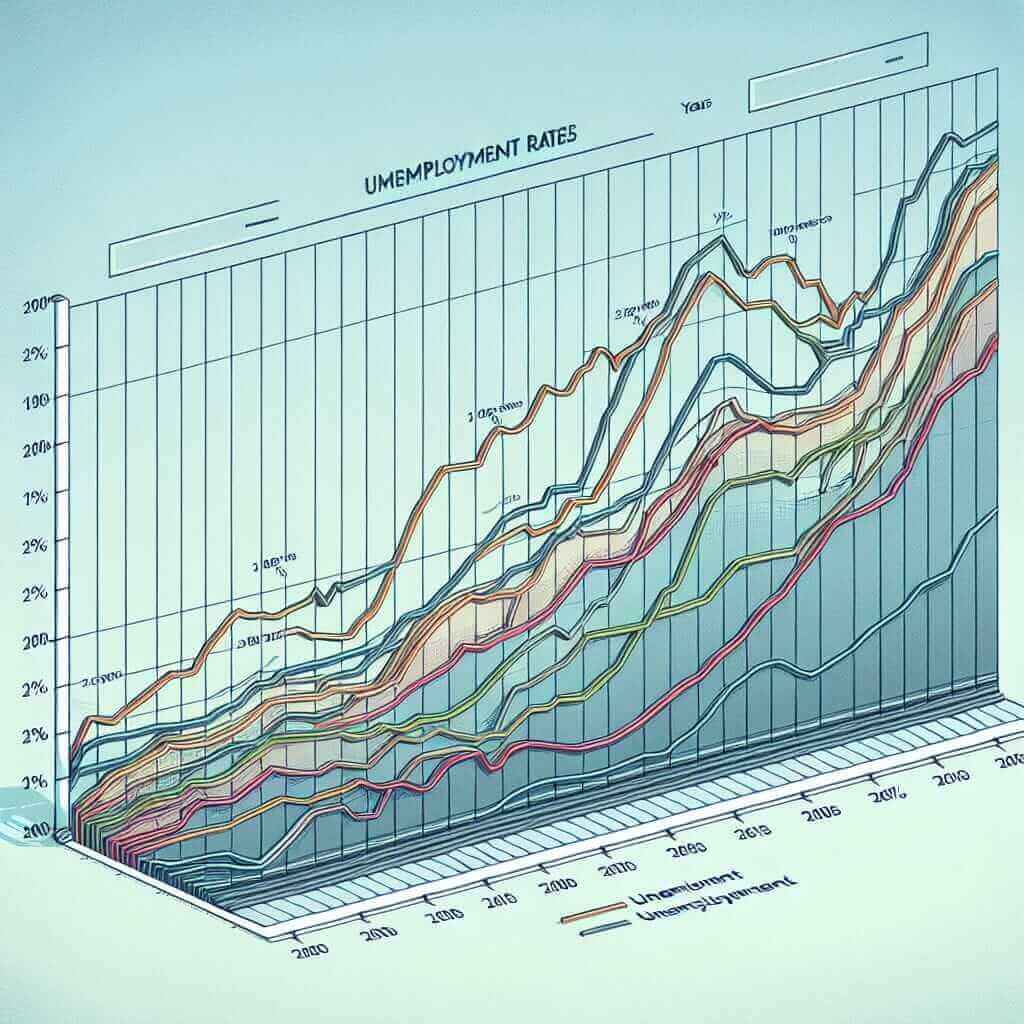
The line graph below shows the unemployment rates in three countries from 2000 to 2010. Summarize the information by selecting and reporting the main features, and make comparisons where relevant. -
Bar Chart Example:
The bar chart shows the percentage of students proficient in three different languages in a particular school in 2018. Summarize the key features.
 IELTS Line Graph – Unemployment Rates
Techniques for Effective Practice
1. Study Sample Answers
Reviewing high-scoring sample answers can provide insight into effective structuring and vocabulary usage. Analyze how these answers organize information and balance overview and details.
2. Timed Practice
Time management is crucial. Practice analyzing and writing about graphs within the allotted 20-minute timeframe.
3. Feedback and Revision
Seek feedback from instructors or peers and revise your work. Understand your mistakes and work on improving them.
4. Use Template Phrases
Familiarize yourself with commonly used phrases for describing trends and comparisons. These templates can help streamline your writing process.
Example Templates:
- Introduction: “The graph provides information about…”
- Describing a trend: “There was a significant increase in…”
- Comparing data: “In comparison to…,” “Similarly…,” “However…”
Conclusion
Analyzing IELTS Writing Task 1 graphs can seem challenging, but with structured practice and a clear approach, it becomes manageable. Focus on understanding the visual data, identifying key trends, using precise vocabulary, and avoiding common mistakes. Consistent practice with real IELTS questions and reviewing sample answers are key strategies in mastering this task. Keep practicing, stay diligent, and you will see improvements in your graph analysis skills.
For more tips and resources, feel free to explore other articles on our website, and don’t hesitate to leave your queries or insights in the comments below!


