The Importance of Choosing the Right Information in IELTS Charts
The IELTS Academic Writing Task 1 often presents you with visual data in the form of charts, graphs, or diagrams. A common challenge is dealing with tasks that include multiple charts. Successfully analyzing and comparing information from multiple sources is crucial for achieving a high band score. This involves not just understanding individual charts, but also identifying the key relationships and trends they reveal when considered together.
Effective Strategies for Choosing Information from Multiple Charts
When you encounter multiple charts in IELTS Writing Task 1, follow these steps to ensure you select and present information effectively:
1. Analyze Each Chart Individually
Before comparing, take a moment to understand each chart separately. Identify:
- Chart Type: Is it a bar chart, line graph, pie chart, table, or a combination?
- Axes and Labels: What variables are being measured? What are the units of measurement?
- Time Period: Does the data represent a specific time period or a trend over time?
2. Identify the Common Theme
Determine the overarching theme connecting the charts.
- Do they present different aspects of the same topic? For example, one chart might show the percentage of people employed in different sectors, while another shows the average salary for each sector.
- Do they offer different perspectives on the same data? For instance, one chart might present sales figures, while another shows customer satisfaction ratings for the same period.
3. Look for Relationships and Contrasts
Once you understand the individual charts and their connection, look for:
- Similarities: Are there any trends or patterns that are consistent across the charts?
- Differences: What are the most significant variations between the charts?
- Correlations: Does a change in one chart appear to be related to a change in another?
- Exceptions: Are there any outliers or anomalies that contradict the general trend?
4. Select the Most Significant Information
Avoid describing everything in detail. Instead, focus on the most striking and relevant information. Consider:
- Key Trends: What are the major changes or patterns over time?
- Significant Comparisons: What are the most notable differences or similarities between the data sets?
- Supporting Data: Choose specific figures or data points that illustrate your key points effectively.
Example: Analyzing IELTS Charts in Action
Let’s imagine you are presented with two charts:
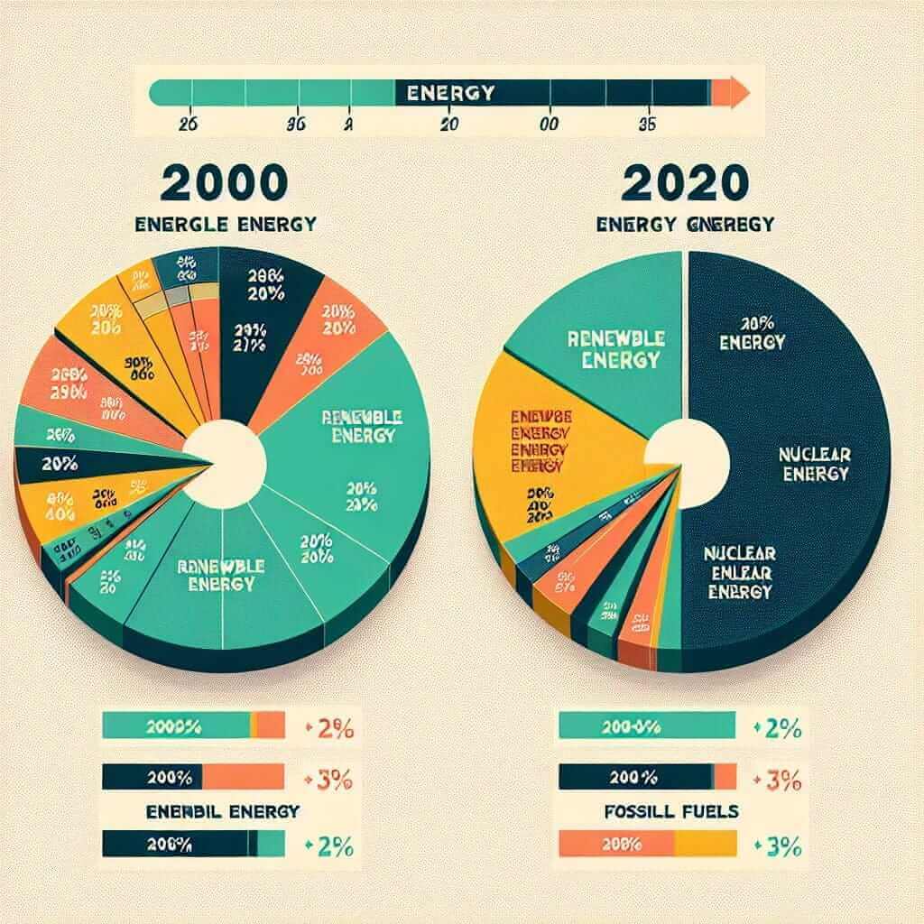
- Chart 1: A pie chart showing the proportion of energy generated from different sources in a country in 2000.
- Chart 2: A similar pie chart showing the same information for the year 2020.
Analysis:
- Individual Analysis: You would examine each chart to see the percentage breakdown of energy sources in each year.
- Common Theme: Both charts relate to energy production in a specific country, providing a comparison over time.
- Relationships/Contrasts: You would look for significant shifts in energy sources between 2000 and 2020 (e.g., an increase in renewable energy, a decrease in fossil fuels).
- Significant Information: Your description would focus on the most dramatic changes in energy production over the two decades, supported by key percentages from the charts.

Tips for Success
- Practice: Regularly analyze multiple-chart tasks from IELTS practice materials.
- Time Management: Allocate your time wisely to analyze all charts effectively.
- Clear and Concise Language: Use precise vocabulary and grammatical structures to present your findings.
- Objective Tone: Avoid expressing personal opinions or making unsupported claims. Stick to the facts presented in the charts.
Conclusion
Mastering the skill of choosing and analyzing information from multiple charts is essential for achieving a high score on the IELTS Academic Writing Task 1. By following a systematic approach, practicing regularly, and developing your analytical skills, you can confidently tackle these tasks and demonstrate your data interpretation abilities to the examiner.