As an IELTS instructor with over two decades of experience, I’ve witnessed countless students grapple with data interpretation in the Speaking test. One common hurdle is describing bar charts effectively. This comprehensive guide delves into the intricacies of this task, providing you with the tools and techniques to conquer any bar chart that comes your way.
Why Bar Chart Descriptions Matter in IELTS
The ability to analyze and articulate visual data is a crucial skill assessed in the IELTS Speaking test. Bar charts, in particular, are frequently employed to present comparative data, making your ability to describe them clearly and accurately essential for achieving a high band score.
Deconstructing the Bar Chart Description
Understanding the Task
In the IELTS Speaking test, you might be presented with a bar chart and asked to describe it in detail. This involves:
- Identifying key features: Recognizing the main trends, highest and lowest points, and any significant differences or similarities presented in the chart.
- Comparing and contrasting data: Highlighting the relationships between different data sets, using comparative and superlative language effectively.
- Summarizing the information: Providing a concise overview of the key trends and patterns shown in the bar chart.
Essential Vocabulary and Grammar
To deliver a high-scoring bar chart description, you need to employ a range of grammatical structures and vocabulary:
- Comparatives and superlatives: “higher than,” “the lowest,” “more significant.”
- Trend language: “increase,” “decrease,” “fluctuate,” “remain stable,” “peak,” “plateau.”
- Prepositions of time: “in,” “between,” “from,” “to,” “over,” “during.”
- Approximations: “approximately,” “around,” “roughly,” “just over,” “slightly less than.”
Step-by-Step Approach
- Analyze the Chart: Take a moment to understand the chart’s title, axes labels, units of measurement, and the categories being compared.
- Identify the Main Trends: Determine the most significant patterns and relationships depicted by the bars. Are there any clear increases, decreases, or fluctuations?
- Structure Your Response: Organize your description logically. You might begin with an overview sentence, then move on to specific details, and finally, provide a brief summary.
- Use Linking Words: Employ cohesive devices like “whereas,” “however,” “in contrast,” “similarly,” to connect your ideas smoothly.
- Practice Makes Perfect: Familiarize yourself with various bar chart types and practice describing them using appropriate vocabulary and grammar.
Illustrative Example
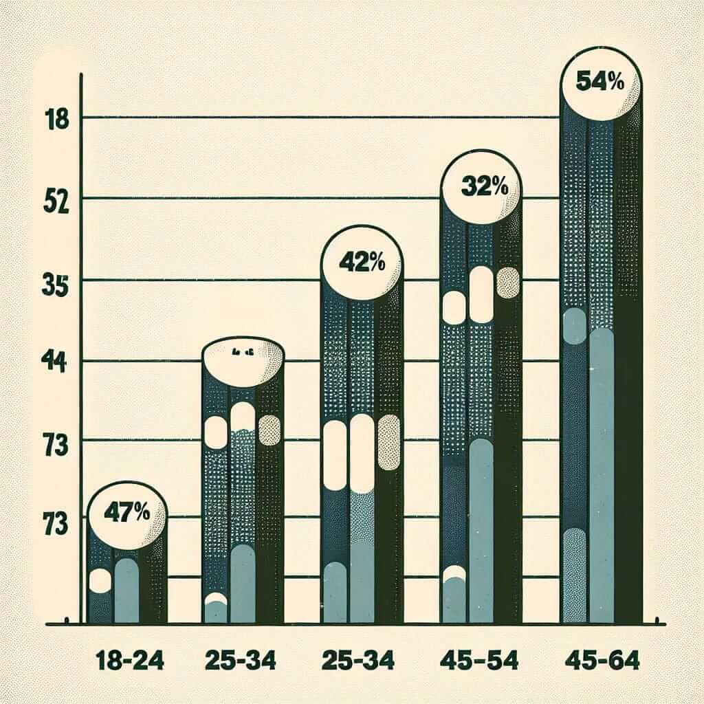
Let’s consider a bar chart illustrating the percentage of people in different age groups who use social media daily:

Sample Description:
“This bar chart illustrates the daily social media usage across various age demographics. As can be seen, social media engagement is most prevalent among 18-24 year-olds, with over 80% reporting daily use. This figure gradually decreases with age, falling to approximately 60% for those aged 35-44. Interestingly, there’s a slight increase in daily usage among the 55-64 age group compared to the 45-54 group, suggesting a growing interest in social media among older demographics.”
Tips for Success
- Don’t over-describe: Focus on the most significant trends and avoid mentioning every single detail.
- Paraphrase the question: Demonstrate your vocabulary range by using synonyms for words in the question prompt.
- Maintain a clear and concise style: Use simple language and avoid overly complex sentence structures.
- Practice speaking at a steady pace: This allows you to articulate your thoughts clearly and ensures the examiner can follow your description.
Conclusion
Mastering bar chart descriptions requires a combination of vocabulary, grammar, and analytical skills. By understanding the task requirements, practicing regularly, and employing the techniques outlined in this guide, you can confidently approach this element of the IELTS Speaking test and boost your overall band score. Remember, consistent effort and targeted practice are key to achieving your desired results.