As an IELTS instructor with over 20 years of experience, I’ve witnessed countless students grapple with the dreaded chart description task in the IELTS Speaking test. It’s a challenge, no doubt, but with the right approach and consistent practice, you can transform this obstacle into an opportunity to showcase your language skills. This guide will equip you with the knowledge and strategies to describe charts in IELTS Speaking confidently and effectively.
Why Describing Charts Matters in IELTS
The ability to interpret and communicate visual data is a valuable skill in today’s data-driven world. The IELTS Speaking test assesses this skill by presenting you with various chart types – line graphs, bar charts, pie charts, tables, or even a combination of these – and asking you to describe the key trends, patterns, and significant features they represent. This task evaluates your ability to:
- Comprehend visual information: Can you accurately interpret the data presented in the chart?
- Organize information logically: Can you structure your description coherently, highlighting the most relevant details?
- Use a wide range of vocabulary: Can you employ a variety of vocabulary related to trends, comparisons, and data interpretation?
- Maintain grammatical accuracy: Can you use a range of grammatical structures accurately and appropriately?
Deconstructing the Chart Description Task
Successfully tackling a chart description involves a strategic approach. Here’s a breakdown of the steps involved:
1. Analyze the Chart
Before you utter a word, dedicate the first minute (you have 1 minute to prepare) to thoroughly analyzing the chart. Ask yourself these questions:
- What type of chart is it? (line graph, bar chart, pie chart, etc.)
- What is the main topic of the chart? What is being measured or compared?
- What is the time frame (if applicable)?
- What units of measurement are used? (percentages, numbers, currency, etc.)
- Are there any striking trends, patterns, or significant features?
2. Structure Your Response
A well-structured response is crucial for clarity and coherence. Here’s a tried-and-tested structure:
Introduction (1-2 sentences):
- Paraphrase the topic of the chart.
- Mention the chart type and the time frame (if applicable).
Example: “This line graph illustrates the changes in the number of people migrating from rural to urban areas in the UK between 1950 and 2010.”
Overview (2-3 sentences):
- State the overall trend or the most striking feature.
- Avoid going into specific details yet.
Example: “Overall, the graph shows a significant increase in the number of people migrating from rural to urban areas throughout the period. The most dramatic rise occurred between 1960 and 1980.”
Body Paragraphs (2-3 paragraphs):
- Describe specific details, trends, and comparisons.
- Group similar data points together for better flow.
- Use linking words and phrases to connect ideas.
Example: “Looking at the details, in 1950, around 20% of the population resided in urban areas. This figure steadily climbed to 30% by 1960, then surged to 60% by 1980, indicating a rapid urbanization trend during this period…”
Conclusion (1 sentence, optional):
- Summarize the main trend or provide a concluding observation.
Example: “In conclusion, the graph clearly demonstrates a consistent upward trend in rural-to-urban migration in the UK throughout the latter half of the 20th century.”
3. Utilize a Rich Vocabulary
Enhance your description by employing a diverse range of vocabulary related to:
- Trends: increase, decrease, rise, fall, fluctuate, peak, plateau, trend upwards/downwards
- Speed of Change: rapid, sharp, dramatic, steady, gradual, slight
- Comparisons: higher than, lower than, twice as much as, compared to, in contrast to
- Approximation: approximately, around, roughly, just over/under
4. Practice Makes Perfect
Like any skill, describing charts effectively requires consistent practice.
- Utilize IELTS practice materials: Familiarize yourself with a variety of chart types and practice describing them within the time limit.
- Record yourself: This allows you to identify areas for improvement in pronunciation, fluency, and vocabulary usage.
- Seek feedback: Ask your IELTS instructor or a language partner to evaluate your descriptions and provide constructive criticism.
Example Chart Description
Let’s look at a sample bar chart and apply the steps we’ve discussed:
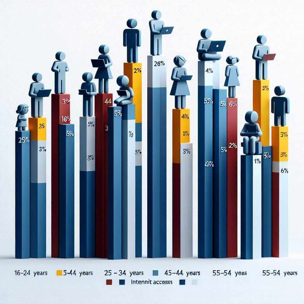
Chart Title: Percentage of Population with Access to the Internet in Different Age Groups (2010 and 2020)

Sample Description:
“This bar chart compares the percentage of people with internet access across different age groups in two years, 2010 and 2020. Overall, we can see a significant increase in internet usage across all age groups over the decade.
In 2010, internet access was highest among younger generations, with 70% of 16-24 year olds and 60% of 25-34 year olds using the internet. This is in stark contrast to the older generations, where only 15% of those aged 55-64 and a mere 5% of those aged 65 and over had access.
By 2020, the gap in internet usage between age groups had narrowed considerably. While almost all 16-24 year olds (95%) and 25-34 year olds (90%) were online, there was also a dramatic rise in internet use among older demographics. For instance, 65% of 45-54 year olds and 40% of 55-64 year olds had internet access, demonstrating a significant shift towards digital inclusion.”
Conclusion
Mastering the art of describing charts in IELTS Speaking might seem daunting at first, but remember: practice makes perfect. By understanding the structure, utilizing the right vocabulary, and analyzing charts strategically, you’ll be well on your way to confidently tackling this task and achieving your desired IELTS score. Keep practicing, and soon you’ll be describing charts like a pro!