Describing a chart might seem daunting at first, but with the right approach and consistent practice, it can become one of the most manageable tasks in the IELTS Speaking test. As an IELTS instructor with over 20 years of experience, I’ve helped countless students master this skill. In this guide, I’ll share my insights and proven strategies to help you confidently tackle any chart description question.
Understanding the Importance of Chart Description in IELTS
The ability to describe visual data clearly and accurately is a valuable skill tested in the IELTS exam. It reflects your analytical and language skills, showcasing your ability to interpret information and present it coherently. A strong performance in this area contributes significantly to your overall Speaking band score.
Step-by-Step Guide to Describing Charts in IELTS Speaking
1. Analyze the Chart
Before you begin speaking, take a moment to understand the chart thoroughly.
- Identify the type of chart: Is it a line graph, bar chart, pie chart, table, or a combination?
- Understand the axes and labels: What does each axis represent? What units are used?
- Identify the key trends and patterns: Are there any significant increases, decreases, or fluctuations? What are the highest and lowest values?
2. Structure Your Response
A well-structured response is crucial for clarity. Here’s a framework you can follow:
-
Introduction (1-2 sentences):
- Paraphrase the topic of the chart. For example, instead of saying “This chart shows…”, you can say “This chart illustrates…” or “The chart provides information about…”.
- Briefly mention the time period covered (if applicable).
-
Overview (2-3 sentences):
- Summarize the main trends and key features.
- Avoid going into specific details at this stage.
-
Body Paragraphs (2-3 paragraphs):
- Describe the most significant trends or patterns in detail.
- Use specific data points and figures from the chart to support your statements.
- Compare and contrast different data sets (if applicable).
-
Conclusion (1-2 sentences):
- Summarize the key takeaways from the chart.
- You can also offer a brief prediction for the future (if appropriate and supported by the data).
3. Utilize a Range of Vocabulary and Grammar
-
Vocabulary:
- Use a variety of verbs to describe trends (e.g., rise, fall, increase, decrease, fluctuate, remain stable).
- Employ adjectives and adverbs to add detail and precision (e.g., significant, gradual, sharp, steadily).
- Use appropriate prepositions to describe time periods and data points (e.g., from…to…, between…and…, at…, in…).
-
Grammar:
- Use different grammatical structures to demonstrate your range.
- Incorporate complex sentences with relative clauses and conjunctions.
- Pay attention to subject-verb agreement and tense consistency.
Example: Describing a Line Graph
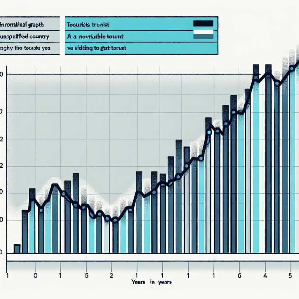
Let’s say you’re presented with a line graph showing the number of tourists visiting a particular country over a decade. Here’s how you could describe it:

-
Introduction: “The line graph illustrates the trend in tourist arrivals in Country X over a ten-year period, from 2010 to 2020.”
-
Overview: “Overall, the number of tourists visiting the country increased significantly over the decade, with a particularly sharp rise observed in the middle of the period.”
-
Body Paragraph 1: “At the beginning of the decade, in 2010, the number of tourists stood at approximately 2 million. This figure gradually increased to around 3 million by 2015.”
-
Body Paragraph 2: “However, from 2015 onwards, there was a dramatic surge in tourist arrivals, reaching a peak of 6 million in 2018. This could be attributed to [mention a possible reason, if provided in the chart or if you can infer].”
-
Conclusion: “In conclusion, the graph clearly demonstrates a positive trend in tourism for Country X, with the number of visitors more than tripling over the ten-year period.”
Essential Tips for Success
- Practice regularly: Familiarize yourself with different chart types and practice describing them aloud. You can use sample IELTS questions and charts online or from preparation books.
- Record yourself: Listening to your recordings can help identify areas where you can improve your pronunciation, fluency, and vocabulary.
- Focus on coherence and fluency: Aim for a smooth and natural flow of speech. Use linking words and phrases to connect your ideas logically.
- Don’t overcomplicate things: If you don’t know a specific word, try to paraphrase or use a simpler alternative. The examiner is primarily interested in your ability to communicate effectively.
- Manage your time effectively: Allocate your time wisely, ensuring you cover all key points within the time limit.
Remember, consistent practice and effective strategies are key to mastering the art of chart description in the IELTS Speaking exam. With dedication and the right approach, you can achieve your desired band score. Good luck!