In the IELTS Academic Writing Task 1, you’ll encounter various data representations, with double line graphs being a frequent visitor. These graphs present two sets of data over time, making it crucial to accurately interpret and describe the trends, comparisons, and key features they illustrate. This guide, crafted by an experienced IELTS instructor with over 20 years of experience, will equip you with the skills to confidently tackle any double line graph description in your IELTS exam.
Understanding Double Line Graphs in IELTS
Double line graphs are powerful tools for visualizing how two related variables change over time. They allow for clear comparisons and highlight trends within each dataset and between them. Understanding these graphs involves:
Identifying the Axes and Data Sets
- X-axis: This usually represents the time period, often displayed in years, months, or other time increments.
- Y-axis: This axis represents the measured variable, such as population, sales figures, or temperature.
- Legends: The graph will include a legend to distinguish between the two datasets, typically represented by different line styles or colors.
Recognizing Trends and Patterns
- Upward trends: Indicate an increase in the measured variable over time.
- Downward trends: Show a decrease in the measured variable over time.
- Fluctuations: Highlight periods of instability or volatility in the data.
- Plateaus: Indicate periods of little or no change.
Describing Double Line Graphs Effectively
Writing a compelling double line graph description requires a structured approach and accurate language. Follow these steps:
1. Analyze the Graph Carefully
Before you begin writing, take a moment to understand the data thoroughly. Identify the main trends, any significant changes, and any points of comparison or contrast between the two datasets.
2. Structure Your Response
A well-organized response is crucial for clarity. Use the following structure as a guide:
- Introduction (1-2 sentences): Paraphrase the graph’s title and state what the graph shows.
- Example: The line graph illustrates the changes in the number of tourists visiting France and Spain from 1995 to 2005.
- Overview (2-3 sentences): Summarize the main trends and key features.
- Example: Overall, both countries saw a rise in tourism, with Spain experiencing a more dramatic increase, particularly after 2000.
- Body Paragraphs (2-3 paragraphs): Provide a detailed description of the trends, comparing and contrasting the two datasets. Use specific data points to support your claims.
- Example: In 1995, France received approximately 70 million tourists, while Spain welcomed around 45 million. However, by 2005, Spain’s tourism numbers surged to nearly 75 million, surpassing France’s figure of 60 million.
- Conclusion (Optional): Briefly restate the main trends or offer a final observation.
3. Use Accurate Vocabulary and Grammar
Employ a range of vocabulary to describe trends, comparisons, and changes. Some useful phrases include:
- To describe trends:
- Increase/decrease significantly/steadily/gradually
- Rise/fall sharply/dramatically
- Peak/reach a high/low point
- Fluctuate/remain stable
- To compare and contrast:
- In contrast to/compared to
- Similarly/likewise
- While/whereas
- To express approximations:
- Approximately/around/roughly
- Just over/just under
- Slightly more/less than
Ensure you use accurate grammar, including correct verb tenses and subject-verb agreement.
Example Description
Let’s analyze an example:

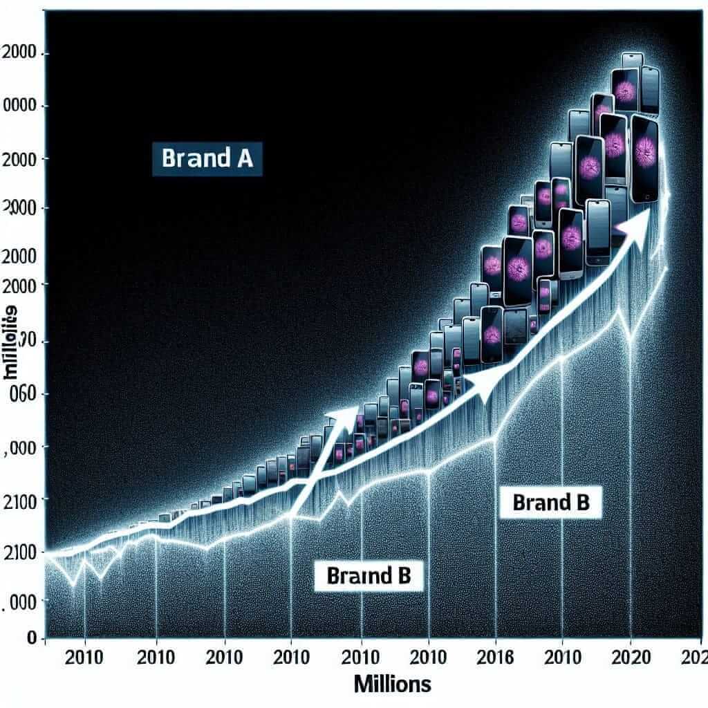
The line graph compares the sales figures of mobile phone brands A and B over a decade, from 2010 to 2020.
Overall, both brands witnessed an upward trend in sales, but Brand B consistently outsold Brand A throughout the period. Brand B experienced a particularly sharp rise in sales after the launch of its new smartphone model in 2016.
In 2010, Brand A sold approximately 10 million units, while Brand B lagged behind with around 7 million units sold. However, Brand B’s sales steadily climbed over the next few years, reaching 15 million units by 2015. In contrast, Brand A’s sales grew at a slower pace, reaching only 12 million units in the same year.
The launch of Brand B’s innovative smartphone in 2016 propelled its sales to new heights. Sales skyrocketed to 25 million units in 2017 and continued to dominate the market, reaching 30 million units by 2020. While Brand A also experienced some growth after 2016, it remained significantly behind Brand B, finishing the decade with around 20 million units sold.
Tips for Success
- Practice consistently: Familiarize yourself with different graph types and practice describing them accurately.
- Use a timer: Simulate exam conditions to improve your time management skills.
- Seek feedback: Have an experienced IELTS instructor or tutor evaluate your writing and provide constructive criticism.
- Focus on clarity and accuracy: Prioritize conveying information clearly and accurately over using complex vocabulary or grammar structures.
Mastering the art of describing double line graphs is an attainable goal with focused practice and a strategic approach. By understanding the nuances of these graphs and utilizing the tips and techniques outlined in this guide, you’ll be well-equipped to achieve success in your IELTS Writing Task 1.