Graphs in IELTS Writing Task 2 might seem intimidating at first, but they’re a valuable tool to assess your ability to interpret and present data effectively. This comprehensive guide will equip you with the necessary skills to analyze graphs and incorporate them seamlessly into your essays, ultimately boosting your IELTS Writing score.
Understanding the Task
The instruction for IELTS Writing Task 2 questions that include a graph will typically ask you to:
- Summarize the information by selecting and reporting the main features.
- Make comparisons where relevant.
You are not required to describe every single detail in the graph. Instead, focus on identifying significant trends, patterns, and key differences or similarities.
Analyzing the Graph
Before you start writing, spend a few minutes carefully analyzing the graph. Here’s a step-by-step approach:
- Identify the type of graph: Is it a line graph, bar chart, pie chart, or table? Each type presents data differently, influencing your analysis.
- Read the title and labels: Pay close attention to the title, axes labels, and legends as they provide crucial context for understanding the data.
- Identify units of measurement: Understanding whether the data is measured in percentages, numbers, or other units is essential for accurate reporting.
- Look for trends and patterns: Are there any noticeable increases, decreases, fluctuations, or static periods? Highlight these key features.
- Make comparisons: If the graph presents multiple variables, identify significant similarities or differences between them.
Example:
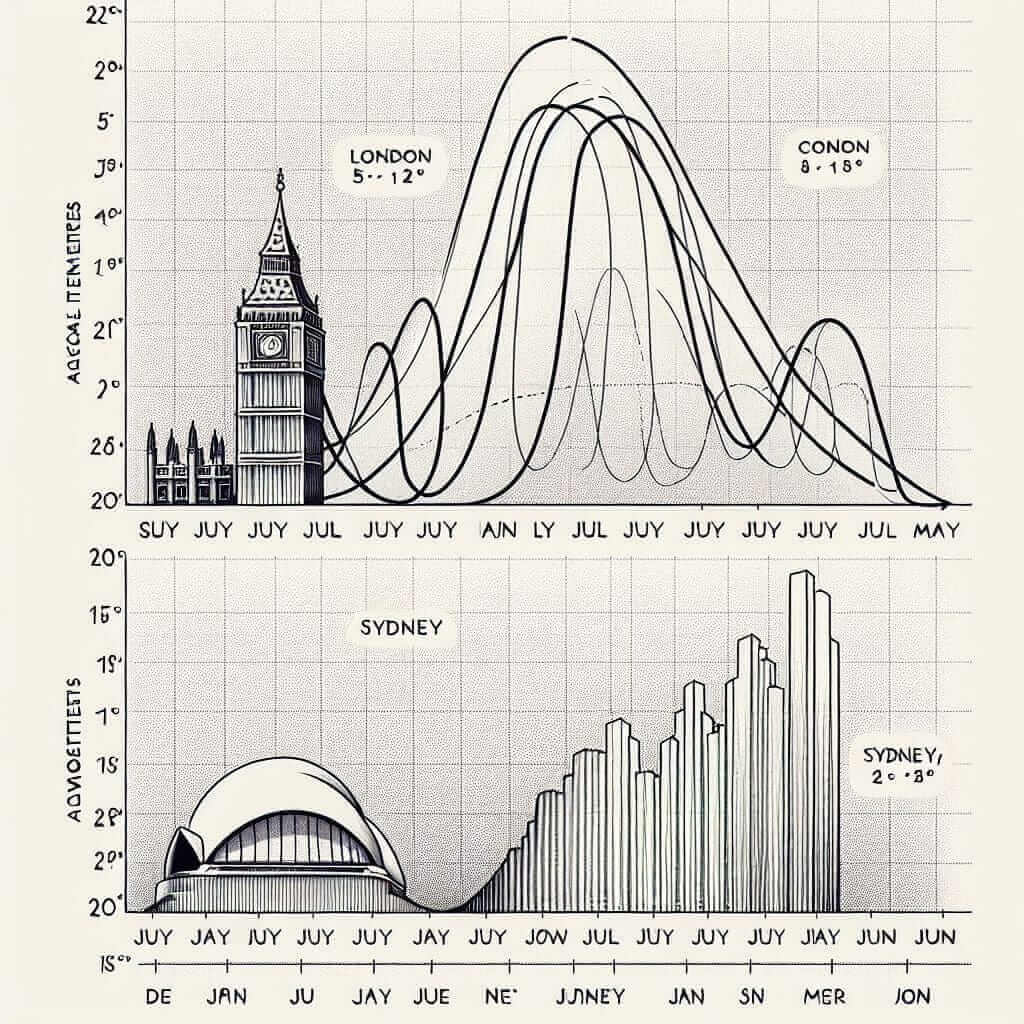
Let’s consider a line graph depicting the “Average monthly temperatures in London and Sydney”:

- Type: Line graph
- Units: Degrees Celsius (°C)
- Trends: London experiences distinct seasons with cold winters and warm summers, while Sydney has milder winters and hotter summers.
- Comparisons: Sydney consistently experiences warmer temperatures than London throughout the year.
Incorporating the Graph into Your Essay
When incorporating data from the graph into your essay, use a variety of grammatical structures and vocabulary to demonstrate your language proficiency.
1. Introducing the Graph:
- Begin with a general statement: “The provided graph illustrates…”
- Paraphrase the title: “The line graph compares average monthly temperatures in London and Sydney.”
2. Reporting Main Features:
- Use reporting verbs: “The graph shows…”, “The data indicates…”, “As can be seen from the graph…”
- Use specific vocabulary: “peak”, “decline”, “fluctuate”, “remain stable”, “significant difference”, “similar trend”
- Support your statements with data: “In London, the average temperature peaks at 20°C in July, whereas Sydney reaches its highest average temperature of 25°C in December.”
3. Making Comparisons:
- Use comparative and superlative adjectives: “warmer”, “the hottest”, “more significant”
- Use comparative structures: “while”, “whereas”, “in contrast to”, “similarly”
- Highlight key differences: “While London experiences a significant drop in temperature during winter, Sydney’s temperature remains relatively mild.”
Sample IELTS Writing Task 2 Response (Band 8)
Question:
The graph below shows the average monthly temperatures in London and Sydney.
Summarize the information by selecting and reporting the main features and make comparisons where relevant.
Answer:
The provided line graph compares the average monthly temperatures in London and Sydney throughout the year. Overall, it is evident that Sydney experiences a warmer climate with less seasonal variation compared to London.
As can be seen from the graph, London’s temperatures follow a distinct pattern of cold winters and warm summers. The average temperature reaches its lowest point in January at around 5°C and gradually climbs to a peak of 20°C in July. Conversely, Sydney enjoys milder winters with average temperatures hovering around 15°C in July and peaks at a much warmer 25°C in December.
One of the most striking differences is the disparity in temperature ranges. While London experiences a significant temperature fluctuation of approximately 15°C between its coldest and warmest months, Sydney’s temperature range is comparatively smaller at about 10°C. This suggests that Sydney enjoys a more temperate climate with less extreme variations throughout the year.
In conclusion, the graph clearly illustrates the contrasting climatic conditions of London and Sydney. While London experiences distinct seasons with cold winters and warm summers, Sydney enjoys a more consistently warm climate with less pronounced seasonal variations.
Common Mistakes to Avoid
- Describing every detail: Focus on the most significant trends and comparisons.
- Misinterpreting data: Pay close attention to units of measurement and avoid making inaccurate claims.
- Using inappropriate language: Employ formal language and avoid informal expressions or slang.
- Ignoring the instructions: Ensure you address all aspects of the task, including summarizing and comparing.
Practice Makes Perfect
To excel in handling graphs in IELTS Writing Task 2, practice is crucial. Familiarize yourself with different graph types, analyze practice questions, and write complete essays incorporating graph data. Consistent practice will enhance your analytical and writing skills, leading to a higher score on the IELTS exam. Good luck!