As an IELTS instructor with over two decades of experience, I’ve witnessed firsthand the struggles students face with IELTS Writing Task 1. Many find themselves lost, unsure how to structure their responses effectively. A well-structured response is crucial for a high band score in this section. This guide will provide you with a clear roadmap to confidently tackle Task 1 and boost your IELTS writing score.
Understanding IELTS Writing Task 1
In the IELTS Academic Writing test, Task 1 requires you to write a minimum of 150 words summarizing, describing, or explaining visual information presented in the form of a:
- Graph: Line graph, bar chart, pie chart
- Diagram: Process diagram, cycle
- Map: Comparing locations, describing changes
- Table: Presenting data in rows and columns
The key is to provide a clear, accurate, and neutral description of the key features and trends presented in the visual.
The Winning Structure for IELTS Writing Task 1
A structured approach is non-negotiable for a high-scoring Task 1 response. Here’s a breakdown of the essential components:
1. Introduction (Paraphrase the Task)
- Begin by paraphrasing the information provided in the question prompt.
- State what the visual represents, including the type of visual, the time period (if applicable), and the main subject.
Example:
- Prompt: The graph below shows the percentage of households in the UK that owned different types of electronic appliances between 1992 and 2002.
- Paraphrase: The line graph illustrates the proportion of UK households possessing various electronic devices over a decade, from 1992 to 2002.
2. Overview (Highlight Key Trends)
- This is a crucial element where you provide a general overview of the main trends, patterns, or changes depicted in the visual.
- Avoid specific details (like numbers) in this paragraph.
- Focus on the most significant information.
Example:
- Overview: Overall, the graph reveals a significant increase in the ownership of personal computers and mobile phones, while the popularity of washing machines remained relatively stable throughout the period.
3. Body Paragraph(s) (Detailed Description)
- Here, you delve into the specifics, providing a more detailed description of the data.
- Divide the information into logical paragraphs based on the trends you identified in the overview.
- Use data (numbers, percentages, dates) from the visual to support your statements.
- Use appropriate vocabulary to describe trends (increase, decrease, fluctuate, peak, plateau).
- Use linking words to ensure a smooth flow of information (however, in contrast, similarly).
Example:
-
Body Paragraph 1: In 1992, only a small percentage of households (10%) owned personal computers. However, this figure rose dramatically to 60% by 2002, indicating a significant rise in computer ownership during this period.
-
Body Paragraph 2: The ownership of mobile phones followed a similar upward trend, increasing from a mere 5% in 1992 to a staggering 90% by the end of the period. This surge in mobile phone ownership can be attributed to… [Provide possible explanation if the visual suggests one].
4. Conclusion (Optional but Recommended)
- While not mandatory, a concluding sentence can be beneficial for summarizing the key findings or highlighting the most significant trend.
Example:
- Conclusion: In conclusion, the graph clearly depicts a significant shift in household appliance ownership in the UK, with personal computers and mobile phones experiencing the most dramatic growth.
Essential Tips for Success
- Practice with Real IELTS Materials: Familiarize yourself with the types of visuals and question formats.
- Time Management is Key: Aim to complete Task 1 within 20 minutes to allow ample time for Task 2.
- Accuracy Matters: Pay close attention to details when interpreting and reporting data.
- Vocabulary is Your Friend: Utilize a wide range of vocabulary to describe trends and patterns.
- Proofread Carefully: Grammatical errors can lower your score. Always allocate a few minutes for proofreading.
Example Task and Response:
Let’s look at a sample IELTS Writing Task 1 prompt and a model response:
Task:
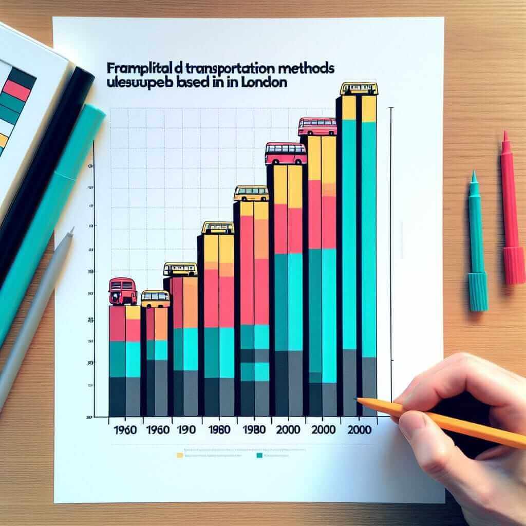
The chart below shows the different modes of transport used by commuters in London in 1960, 1980, and 2000.
<
Model Response:
The bar chart illustrates the changes in transportation methods used by London commuters across three specific years: 1960, 1980, and 2000.
Overall, the chart reveals a significant decline in the use of buses, while the popularity of underground and car travel increased over the period.
In 1960, buses were the most popular mode of transport, with approximately 40% of commuters relying on them. However, by 2000, this figure had plummeted to just 15%. In contrast, the underground system experienced a steady increase in usage, rising from 25% in 1960 to 38% in 2000.
Car travel followed a similar upward trend, albeit with a less dramatic increase. In 1960, only 10% of commuters opted for cars. This percentage gradually grew to 22% in 1980 and finally reached 30% by 2000.
In conclusion, the chart highlights a clear shift in commuter preferences in London, with a notable move towards underground and car travel and a decline in the use of buses.
Mastering IELTS Writing Task 1
By following this structured approach and incorporating these tips, you’ll be well on your way to achieving a high band score in IELTS Writing Task 1. Remember, practice makes perfect!