Introduction
The IELTS Writing Task 1 often presents you with visual data, and one common type is the bar chart. This task assesses your ability to analyze and describe data clearly and accurately in a well-structured manner. Mastering the art of writing about bar charts is crucial for achieving a high score in the IELTS Writing section.
This comprehensive guide will equip you with the knowledge and strategies to write a band-scoring IELTS bar chart example.
Understanding Bar Charts and Their Significance in IELTS
Bar charts use rectangular bars to represent and compare data across different categories. They are effective for visualizing trends, patterns, and comparisons. In the IELTS Writing Task 1, you might encounter bar charts related to various topics, such as demographics, education, employment, or consumer behavior.
Understanding how to interpret and describe these charts demonstrates your analytical and language skills, which are crucial for academic and professional success.
A Step-by-Step Guide to Writing an IELTS Bar Chart Example
1. Analyze the Chart Carefully
Before you start writing, take a few minutes to thoroughly examine the bar chart. Pay attention to:
- Title and Labels: These provide context and indicate what the chart is about.
- Axes: Identify the variables represented on the horizontal (x-axis) and vertical (y-axis) axes.
- Units of Measurement: Note how the data is measured (e.g., percentages, numbers, currency).
- Key Trends: Look for significant increases, decreases, fluctuations, or patterns in the data.
2. Structure Your Response
A well-structured response is essential for clarity. Organize your essay into four distinct paragraphs:
- Paragraph 1 (Introduction): Paraphrase the chart’s title and briefly describe what it shows.
- Paragraph 2 (Overview): Summarize the main trends or patterns you observe in the chart.
- Paragraph 3 (Details): Provide specific details and comparisons, supporting your statements with data from the chart.
- Paragraph 4 (Conclusion): Briefly restate the main trends or findings. (Optional)
3. Use Accurate and Varied Vocabulary
Employ a range of vocabulary to describe the data and trends. Some useful verbs and phrases include:
- To show, to illustrate, to depict, to represent
- To increase, to rise, to surge, to soar, to climb, to go up, to escalate
- To decrease, to decline, to drop, to fall, to plummet, to plunge
- To remain stable, to level off, to stabilize, to remain constant
- To be higher/lower than, to be more/less than, to be similar to, to be in contrast to
4. Support Your Statements with Data
Always support your descriptions and comparisons with specific data points from the chart. For example, instead of writing “Sales increased significantly,” write “Sales increased significantly from 20% in 2010 to 50% in 2020.”
5. Proofread Carefully
Before submitting your response, take a few moments to proofread for any grammatical errors, spelling mistakes, or inconsistencies in your writing.
IELTS Bar Chart Example
Let’s apply these steps to an example:

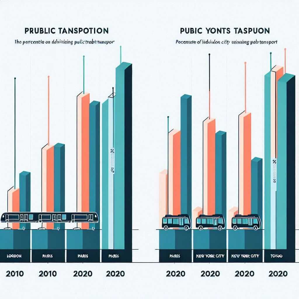
The bar chart illustrates the percentage of people using public transportation in four different cities in 2010 and 2020.
Overall, the proportion of the population using public transport increased in all four cities over the decade.
In 2010, London had the highest percentage of public transport users at 60%, followed by Paris at 45%. New York City had a significantly lower rate of 25%, while Tokyo had the lowest at only 15%. By 2020, the proportion of people using public transport had risen in all cities. London saw a modest increase to 65%, while Paris experienced a more substantial jump to 55%. New York City and Tokyo also showed notable increases, reaching 35% and 25% respectively.
In conclusion, the use of public transportation became more prevalent in all four cities between 2010 and 2020, with London consistently having the highest rate.
Tips for Success
- Practice Regularly: Familiarize yourself with various types of bar charts and practice writing descriptions.
- Time Management: Allocate sufficient time for each writing task. Aim to complete Task 1 within 20 minutes.
- Focus on Clarity and Accuracy: Use clear and concise language to convey the information accurately.
- Review Model Answers: Analyze sample bar chart essays to understand the desired structure and language.
Conclusion
Mastering the skill of writing about bar charts is essential for success in the IELTS Writing Task 1. By following these steps and practicing consistently, you can confidently analyze and describe bar charts, improving your chances of achieving a high score in the IELTS exam. Remember, clear and concise communication of data is key to demonstrating your analytical and language proficiency.