Understanding the IELTS Writing Task 1 Line Graph
IELTS Writing Task 1 line graphs are a common challenge for test-takers. These visual representations of data over time require careful analysis and clear description. This guide will help you navigate the intricacies of line graph questions and boost your confidence in tackling them effectively.
What is a Line Graph in IELTS Writing Task 1?
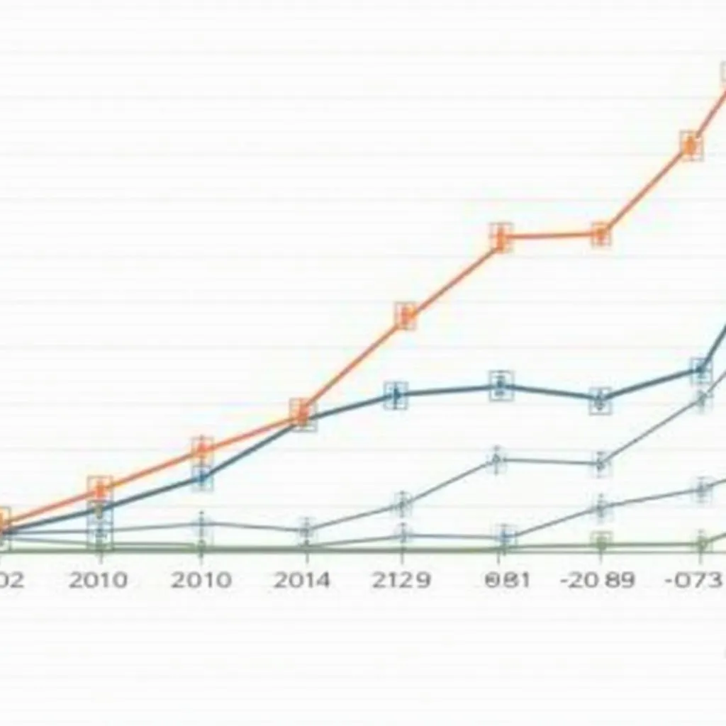
A line graph in IELTS Writing Task 1 typically shows changes or trends over a period of time. It consists of two axes: the horizontal axis (x-axis) usually represents time, while the vertical axis (y-axis) shows the measured variable. Lines connecting data points illustrate the trends or changes in the data.

Key Elements to Analyze in a Line Graph
When approaching a line graph question, focus on these crucial aspects:
- Overall trend
- Specific data points
- Comparisons between different lines
- Significant changes or fluctuations
Identifying the Overall Trend
Start by describing the general direction of the data. Is it increasing, decreasing, or fluctuating? This overview sets the stage for your detailed analysis.
Example: “The graph shows a general upward trend in internet usage across all age groups from 2000 to 2020.”
Analyzing Specific Data Points
Highlight important data points, especially at the beginning and end of the time period, or any significant peaks or troughs.
Example: “In 2000, only 10% of people aged 65 and above used the internet, but this figure rose dramatically to 70% by 2020.”
Making Comparisons
Compare different lines or data sets within the graph. Look for similarities, differences, or intersections between the lines.
Example: “While internet usage among 18-24 year-olds remained consistently high throughout the period, the over-65 age group showed the most significant growth, narrowing the gap between the youngest and oldest users.”
Describing Significant Changes
Identify and describe any notable changes, such as rapid increases, sudden drops, or periods of stability.
Example: “There was a sharp increase in internet usage among 45-54 year-olds between 2005 and 2010, rising from 45% to 75% in just five years.”
Structure of Your Response
Organize your response clearly and logically using this structure:
- Introduction: Summarize what the graph shows
- Overview: Describe the main trends or features
- Detailed analysis: Discuss specific data and comparisons
- Conclusion: Summarize the key points (optional)
Introduction
Begin with a paraphrase of the question, clearly stating what the graph represents.
Example: “The line graph illustrates the changes in internet usage among different age groups in the United States from 2000 to 2020.”
Overview
Provide a general summary of the main trends or features of the graph.
Example: “Overall, there was a significant increase in internet usage across all age groups over the 20-year period, with older age groups showing the most dramatic growth.”
Detailed Analysis
This is the main body of your response. Analyze specific data points, make comparisons, and describe significant changes. Use a variety of language and linking words to connect your ideas.
Example:
“In 2000, there was a clear generational divide in internet usage. While 80% of 18-24 year-olds were online, only 10% of those aged 65 and above used the internet. However, this gap narrowed considerably over the following two decades.
The most dramatic increase was seen in the 65+ age group, which rose from 10% to 70% by 2020, representing a sevenfold increase. Meanwhile, the 45-54 age group experienced a sharp rise between 2005 and 2010, jumping from 45% to 75% before plateauing in the following years.
Interestingly, the 18-24 and 25-34 age groups showed the least change, maintaining high usage rates throughout the period. By 2020, these groups had almost universal internet adoption, with usage rates above 95%.”
Conclusion (Optional)
If time allows, briefly summarize the key points of your analysis.
Example: “In conclusion, the graph demonstrates a significant increase in internet usage across all age groups from 2000 to 2020, with older generations showing the most substantial growth and narrowing the digital divide.”
Common Pitfalls to Avoid
- Don’t simply list all the numbers without analysis.
- Avoid using personal opinions or speculating about reasons for trends.
- Don’t ignore any parts of the graph or data sets.
- Ensure you use appropriate tenses (usually past tense for completed trends).
Practice and Improvement
To excel in IELTS Writing Task 1 line graphs:
- Practice regularly with various graph types and topics.
- Time yourself to ensure you can complete the task within 20 minutes.
- Use a wide range of vocabulary to describe trends and changes.
- Review sample answers and expert analyses to understand effective approaches.
By following this guide and practicing consistently, you’ll be well-prepared to tackle any line graph question in your IELTS Writing Task 1. Remember to analyze thoroughly, structure your response clearly, and use precise language to accurately describe the data presented.