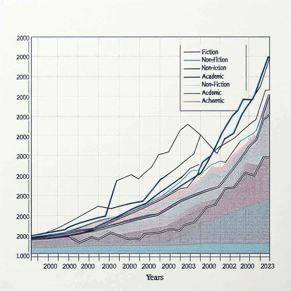
In the IELTS Writing Task 1, you may be asked to describe and analyze various types of data presented in different forms such as charts, tables, graphs, and diagrams. One of the possible topics you might encounter is the sales of different types of books over a specific time period. This topic not only tests your ability to interpret data but also evaluates your skills in writing clear and coherent reports.
Overview of Sales Data from 2000 to 2023
Common IELTS Writing Task 1 Instructions
Let’s consider three potential IELTS Writing Task 1 prompts related to “Sales of Different Types of Books (2000-2023)”:
- Line Graph: The line graph below shows the sales of different types of books from 2000 to 2023.
- Bar Chart: The bar chart below illustrates the annual sales of various types of books between 2000 and 2023.
- Table: The table below provides data on the sales of different types of books from 2000 to 2023.
For this example, we will choose the line graph to create a detailed analysis and a sample task response.
Line Graph Example Prompt
The line graph below shows the sales of three different types of books (fiction, non-fiction, and academic) from 2000 to 2023. Summarize the information by selecting and reporting the main features, and make comparisons where relevant.
Sample Data Representation
To create our sample line graph, let’s assume the following values (in millions of units sold) for each year:
| Year | Fiction | Non-Fiction | Academic |
|---|---|---|---|
| 2000 | 20 | 15 | 30 |
| 2005 | 25 | 10 | 28 |
| 2010 | 22 | 12 | 33 |
| 2015 | 18 | 20 | 40 |
| 2020 | 15 | 28 | 45 |
| 2023 | 13 | 25 | 50 |
(Note: For the actual exam, you would be provided with a visual representation)

Analysis of the Line Graph
When analyzing a line graph in IELTS Writing Task 1, it is crucial to identify:
- Overall Trends: What are the main trends observed over the entire period?
- Key Data Points: What are the significant highs and lows or changes in the data?
- Comparisons: How do the different categories compare with each other at various points?
Writing the Analysis
Introduction
Your introduction should paraphrase the question statement.
“The line graph illustrates the sales of fiction, non-fiction, and academic books from 2000 to 2023.”
Overview
Provide an overall summary of the main trends.
“Overall, while the sales of academic books showed a steady increase over the period, the sales of fiction books experienced a significant decline. Non-fiction book sales fluctuated but ultimately increased.”
Detailed Paragraphs
Describe and compare the data, focusing on significant trends and figures.
Paragraph 1:
“In 2000, the sales of academic books were the highest at 30 million units, while fiction and non-fiction books sold 20 million and 15 million units, respectively. By 2005, fiction book sales slightly increased to 25 million units, but non-fiction book sales dropped to 10 million units. Academic book sales remained relatively stable at 28 million units during this period.”
Paragraph 2:
“From 2010 to 2023, there was a notable decline in the sales of fiction books. By 2023, fiction book sales had decreased to 13 million units. In contrast, non-fiction book sales showed a marked increase, peaking at 28 million units in 2020 before slightly declining to 25 million units in 2023. Academic books continued their upward trend, reaching 50 million units by the end of the period.”
Word Count
Ensure the essay is within the required word limit (at least 150 words).
Word Count: 189 words.
Key Vocabulary and Grammar Tips
Vocabulary for Describing Trends
- Nouns: increase, decrease, fluctuation, stability
- Verbs: rise, fall, increase, decrease, level off, peak, fluctuate
- Adjectives/Adverbs: significant, steady, slight, dramatic, gradually, moderately
Example Sentences
- “The sales of academic books increased steadily from 30 million units in 2000 to 50 million units in 2023.”
- “Fiction book sales experienced a significant decline, falling from 25 million units in 2005 to 13 million units in 2023.”
- “Non-fiction book sales fluctuated, reaching a peak of 28 million units in 2020 before slightly decreasing to 25 million units in 2023.”
Important Grammar Tips
-
Use of Tenses:
- Past simple tense for completed actions (e.g., “The sales of academic books were the highest at 30 million units.”)
- Present perfect tense for actions continuing up to the present (e.g., “Academic books have shown a steady increase over the period.”)
-
Comparative Structures:
- Use comparative adjectives to compare different categories (e.g., “Non-fiction book sales were lower than fiction book sales in 2000.”)
Vocabulary to Remember
- Fluctuate (verb) /ˈflʌktʃueɪt/: to change or vary frequently
- Peak (verb/noun) /piːk/: to reach the highest point or level
- Decline (verb/noun) /dɪˈklaɪn/: a gradual and continuous decrease in numbers
- Steady (adj.) /ˈstɛdi/: stable, consistent over time
- Dramatic (adj.) /drəˈmætɪk/: sudden and striking change
Conclusion
To achieve a high band score in IELTS Writing Task 1 when describing graphs or charts, it’s crucial to provide a clear introduction, an insightful overview, and detailed paragraphs with accurate data comparisons. Remember to use a variety of vocabulary and grammar structures to convey trends effectively and precisely.
By mastering these techniques, you can effectively tackle any data interpretation question in the IELTS Writing Task 1, boost your confidence, and achieve your desired band score.