Urbanization has been a significant trend globally, impacting cities and their populations substantially. Analyzing urban population growth trends is a common topic in the IELTS Writing Task 1, where candidates are required to interpret data and elucidate changes concisely and accurately. This article explores this topic in-depth to assist you in crafting an effective response tailored for a high IELTS score.
Analysis of Task Frequency and Sample Prompts
The topic of urban population trends frequently appears in IELTS Writing Task 1. It typically involves interpreting data presented in line graphs, bar charts, tables, or pie charts. Here are a few sample prompts:
- “The graph below shows the urban population growth in different regions between 2000 and 2023. Summarize the information by selecting and reporting the main features, and make comparisons where relevant.”
- “The table below reflects the percentage change in urban populations in various countries from 2000 to 2023. Summarize the information by selecting and reporting the main features, and make comparisons where relevant.”
- “The chart below illustrates the increase in urban population across different continents from 2000 to 2023. Summarize the information by selecting and reporting the main features, and make comparisons where relevant.”
Choosing a Sample Prompt for Detailed Analysis
Let’s take the first prompt for our detailed analysis and model answer creation:
“The graph below shows the urban population growth in different regions between 2000 and 2023. Summarize the information by selecting and reporting the main features, and make comparisons where relevant.”
Finding and Creating Data
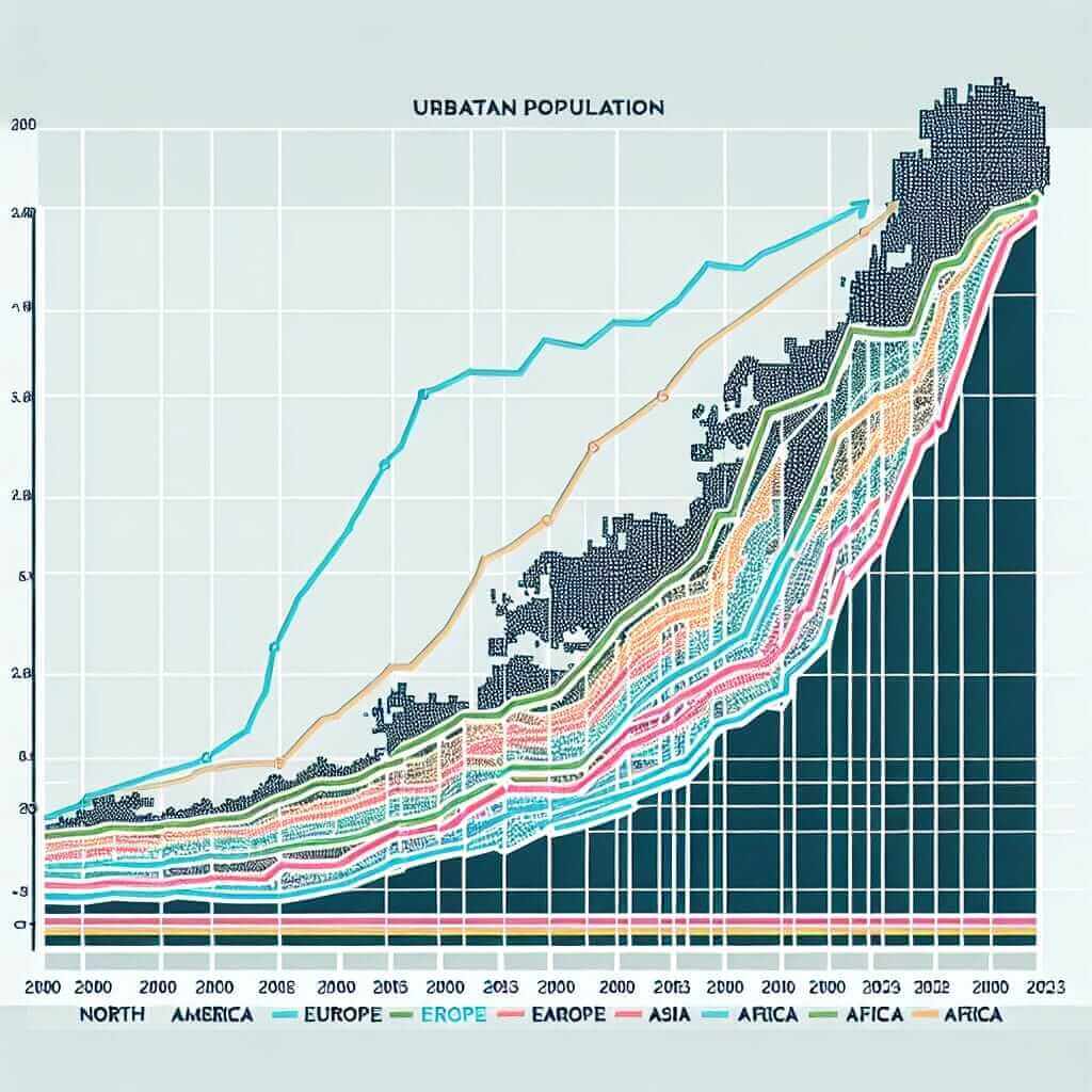
For the purposes of this exercise, let’s create a hypothetical line graph showing urban population growth in four regions: North America, Europe, Asia, and Africa.
| Year | North America | Europe | Asia | Africa |
|---|---|---|---|---|
| 2000 | 280 million | 320 million | 1.8 billion | 700 million |
| 2005 | 300 million | 340 million | 2.0 billion | 800 million |
| 2010 | 320 million | 360 million | 2.3 billion | 900 million |
| 2015 | 350 million | 370 million | 2.6 billion | 1 billion |
| 2020 | 360 million | 380 million | 2.8 billion | 1.2 billion |
| 2023 | 370 million | 390 million | 3.0 billion | 1.3 billion |
Analyzing the Prompt
The given line graph illustrates the rise in urban population across North America, Europe, Asia, and Africa from 2000 to 2023. Key points to consider are:
- Identify general trends for each region.
- Make comparisons between the regions.
- Highlight significant changes or milestones within the period.
Model Answer
Based on the data table and analysis, here is a model answer:
The line graph displays the growth of urban populations in four distinct regions—North America, Europe, Asia, and Africa—over the span from 2000 to 2023.
The overall trend reveals a steady increase in urban populations across all regions. Asia experienced the most dramatic growth, nearly doubling its urban population from 1.8 billion in 2000 to 3.0 billion in 2023. Africa also saw significant growth, with its urban demographic increasing from 700 million to 1.3 billion within the same period.
In contrast, urban population growth in North America and Europe was more modest. North America’s urban population rose from 280 million in 2000 to 370 million in 2023, while Europe’s figures grew from 320 million to 390 million.
Comparatively, Asia’s urban population was consistently higher than the other regions throughout the years. However, despite its slower growth rate, Africa’s urban population increase is noteworthy, indicating a rapid pace of urbanization.
In summary, while all regions displayed upward trends in urban population growth, Asia and Africa exhibited the most significant increases, with Asia leading in overall urban population size.
(176 words)

Writing Tips for This Topic
When composing your response, keep the following in mind:
- Introduction: Briefly describe what the graph or chart shows without diving into specifics.
- Overview: Summarize the main trends and patterns. This section should provide a snapshot of the most significant changes.
- Details: Use separate paragraphs to describe the data in more detail. Use comparative language to highlight differences and similarities.
Vocabulary to Remember
Here are some useful terms you might encounter:
- Urbanization (n. /ˌɜr·bə·nɪˈzeɪ·ʃən/): The process by which an increasing percentage of a population comes to live in cities.
- Dramatic (adj. /drəˈmæt.ɪk/): Sudden and striking.
- Significant (adj. /sɪɡˈnɪf.ɪ.kənt/): Sufficiently great or important to be worthy of attention.
- Consistent (adj. /kənˈsɪs.tənt/): Acting or done in the same way over time.
- Comparatively (adv. /kəmˈpær.ə.tɪv.li/): To a moderate degree as compared to something else; relatively.
Conclusion
To score highly in IELTS Writing Task 1, it is essential to accurately interpret data and present it logically. Understanding urban population growth trends from 2000 to 2023, as discussed, provides a solid framework for analyzing similar topics in the exam. Focus on clear, concise, and comparative descriptions to achieve a band 7 or higher.
By adhering to these guidelines and practicing regularly, you can significantly improve your ability to tackle any data interpretation task in the IELTS exam. Keep honing your skills, and good luck!