In recent years, the topic of renewable energy usage in households has gained significant attention due to its critical role in addressing climate change and promoting sustainable living. This surge in interest has also been reflected in IELTS Writing Task 1, where candidates may be asked to describe data pertaining to the use of renewable energy sources in homes over a specific period. In this guide, we will explore an example of such a question, analyze it, and provide a detailed model answer.
Common IELTS Writing Task 1 Questions on Renewable Energy Usage
The IELTS Writing Task 1 often includes questions that require candidates to describe, summarize, or explain information presented in graphs, charts, tables, or diagrams. Here are some example questions related to renewable energy usage in households:
- The line graph below shows the usage of renewable energy in households from 2000 to 2023. Summarize the information by selecting and reporting the main features, and make comparisons where relevant.
- The bar chart illustrates the percentage of households using various types of renewable energy sources in 2000, 2010, and 2023. Summarize the information by selecting and reporting the main features, and make comparisons where relevant.
- The table below provides information on the usage of solar, wind, and hydro energy in households from 2000 to 2023. Summarize the information by selecting and reporting the main features, and make comparisons where relevant.
Analyzing a Line Graph Example
Let’s focus on this prompt: “The line graph below shows the usage of renewable energy in households from 2000 to 2023. Summarize the information by selecting and reporting the main features, and make comparisons where relevant.”
Creating a Sample Line Graph
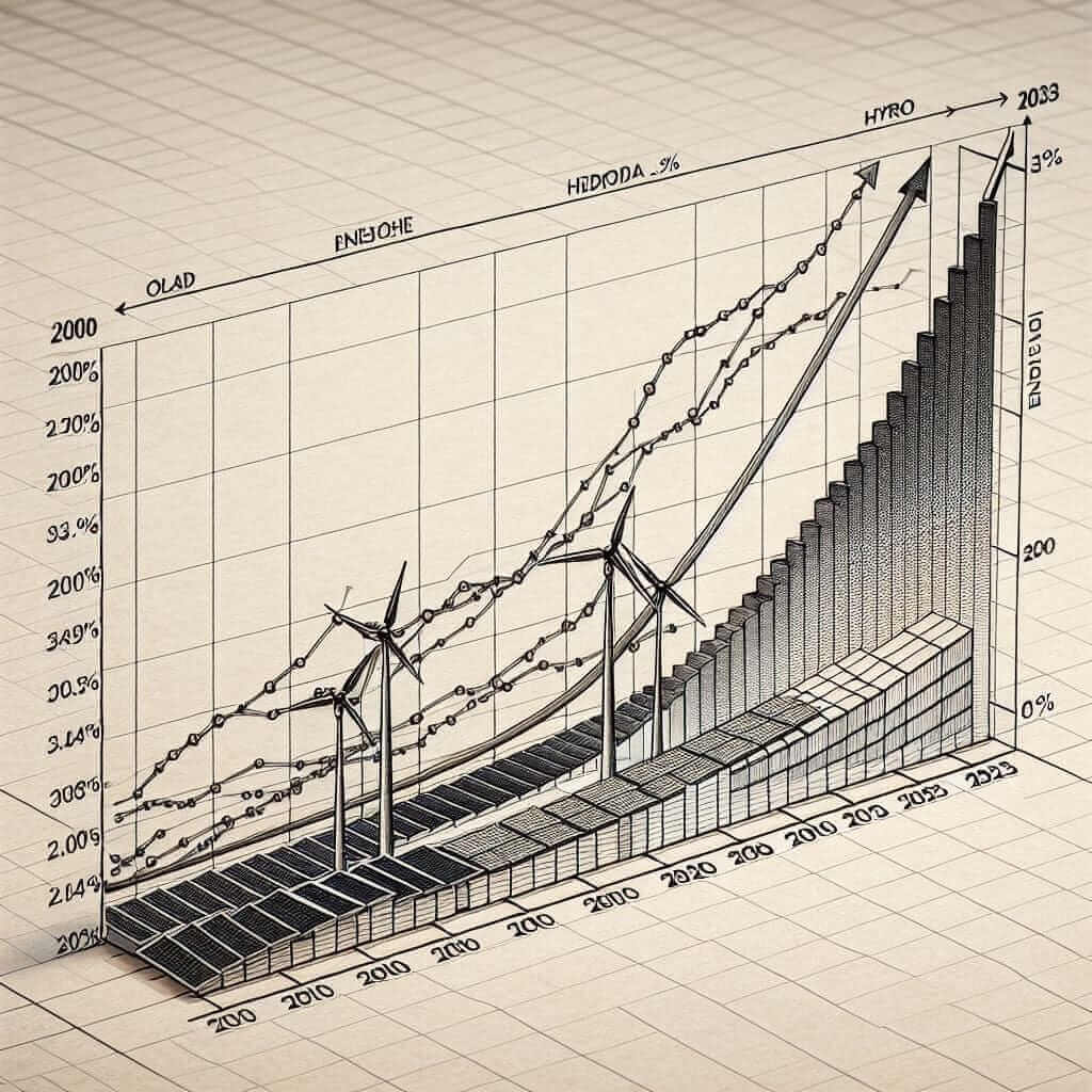
To provide a comprehensive analysis, we’ll create a hypothetical line graph featuring three types of renewable energy sources: solar, wind, and hydro energy.
Sample Data:
| Year | Solar Energy | Wind Energy | Hydro Energy |
|---|---|---|---|
| 2000 | 5% | 3% | 15% |
| 2005 | 10% | 5% | 18% |
| 2010 | 20% | 7% | 20% |
| 2015 | 30% | 10% | 22% |
| 2020 | 45% | 15% | 25% |
| 2023 | 60% | 20% | 30% |

Analysis of the Question
Step 1: Understanding the Graph
- Identify the time frame (2000 to 2023).
- Note the three types of renewable energy.
- Look for trends, significant increases or decreases, and any points of interest.
Step 2: Planning the Answer
- Start with an introduction indicating what the graph shows.
- Provide an overview highlighting the key trends.
- Describe each type of energy in detail, comparing where relevant.
Model Answer
The line graph illustrates the percentage of households utilizing three types of renewable energy—solar, wind, and hydro—from 2000 to 2023.
Overall, the usage of all three renewable energy sources in households has increased significantly over the given period. Notably, solar energy usage has seen the most dramatic rise, while hydro energy remains the most consistently used source throughout the years.
In 2000, solar energy was utilized by only 5% of households. This figure saw a steady climb to 10% in 2005 and then surged to 20% by 2010. The trend continued, with solar energy usage reaching 45% in 2020 and peaking at 60% by 2023, illustrating a clear preference for solar power among households in recent years.
Wind energy showed a more gradual increase compared to solar. Starting at 3% in 2000, it rose to 5% in 2005 and 7% in 2010. By 2015, the figure had increased to 10%, and it continued to rise, reaching 15% in 2020 and 20% by 2023.
Hydro energy, on the other hand, started at a relatively high level of 15% in 2000 and experienced a slower but steady increase. By 2023, 30% of households were using hydro energy. Although it did not grow as rapidly as solar energy, hydro energy remained a substantial source throughout the 23-year period.
In summary, the data indicates a rising trend in the adoption of renewable energy in households, with solar energy showing the most substantial growth, followed by wind and hydro energy.
(Word count: 232)
Key Vocabulary and Grammar for Writing About Renewable Energy
Vocabulary
- Utilize (v) /ˈjuː.t̬əl.aɪz/: to use something, especially for a practical purpose.
- Surge (n) /sɜːrdʒ/: a sudden and great increase.
- Dramatic (adj) /drəˈmæt.ɪk/: significant or noticeable in scale or effect.
- Preference (n) /ˈpref.ər.əns/: a greater interest in or desire for something.
- Gradual (adj) /ˈɡrædʒ.u.əl/: happening or changing slowly over a long period of time.
- Substantial (adj) /səbˈstæn.ʃəl/: large, important; major, significant.
Grammar Focus: Comparatives and Superlatives
When describing trends in line graphs, it is essential to use comparative and superlative forms appropriately.
- Comparatives: Used to compare two things or indicate an increase or decrease (e.g., “Solar energy usage increased more significantly than wind energy.”)
- Superlatives: Used to describe the highest degree of a quality in a group (e.g., “Solar energy had the most dramatic rise.”)
Writing Tips
- Accuracy and Clarity: Ensure that your description of the data is accurate and clear. Avoid overcomplicating sentences.
- Variety in Sentence Structures: Use a mix of simple, compound, and complex sentences to make your writing more engaging.
- Logical Flow: Organize your paragraphs logically, starting with an introduction, followed by a clear overview, and detailed paragraphs for each trend.
Conclusion
Understanding how to effectively describe and analyze data related to the usage of renewable energy in households is crucial for success in the IELTS Writing Task 1. By following the tips outlined in this guide and practicing with model answers, you can enhance your writing skills and aim for a high band score. Remember to pay attention to key vocabulary, use appropriate grammar, and ensure your writing is both accurate and coherent.
By mastering these techniques, you will be well-prepared to tackle similar questions in the IELTS exam and achieve your desired score.