The IELTS Writing Task 1 requires you to describe visual information, such as graphs, charts, maps, or diagrams, in your own words. This task assesses your ability to present data clearly and accurately, using appropriate vocabulary and grammar. Mastering this section is crucial for a high IELTS score.
Many candidates struggle to achieve their desired band score due to some common pitfalls. This article will delve into those frequent mistakes, provide illustrative examples, and offer practical tips to help you avoid them. By understanding and addressing these areas, you can significantly improve your chances of IELTS Writing Task 1 success.
Understanding the Task Requirements
One of the most fundamental mistakes candidates make is not fully comprehending what the task demands. This often leads to irrelevant information, inaccurate data interpretation, and ultimately, a lower score.
Example:
Let’s say the provided visual information is a line graph showing the population growth of two cities over a period. A common mistake is to delve into the reasons behind the population changes instead of simply describing the trends shown in the graph.
How to avoid this mistake:
- Read the instructions carefully: Pay close attention to the prompt and ensure you understand what type of visual information you need to describe and what specific aspects you should focus on.
- Paraphrase the question: Begin your response by paraphrasing the question in your own words. This demonstrates your understanding of the task and helps you to stay on topic.
Lack of Coherence and Cohesion
Your response should not be a collection of disjointed sentences but a well-structured and cohesive piece of writing. This involves using appropriate linking words and phrases to connect ideas, maintain a logical flow, and guide the reader through your description.
Example:
Incorrect: The number of people using mobile phones increased. The use of landlines decreased.
Correct: While the number of people using mobile phones increased, the use of landlines decreased.
How to improve coherence and cohesion:
- Use a range of linking words: Familiarize yourself with different categories of linking words, such as those indicating contrast (however, although), addition (furthermore, in addition), or cause and effect (as a result, consequently).
- Structure your response logically: Organize your writing into clear paragraphs, each focusing on a specific aspect of the visual information.
Insufficient Data Analysis
Simply stating the obvious is not enough to achieve a high score. You need to demonstrate your ability to analyze and interpret the data, identifying significant trends, patterns, and comparisons.
Example:
Inadequate: The graph shows that sales of product A were higher than product B in all years.
Improved: The graph reveals a consistent trend of higher sales for product A compared to product B throughout the given period.
How to improve data analysis:
- Identify key features: Focus on the most significant information presented in the visual, such as the highest and lowest points, any sudden changes, or overall trends.
- Make comparisons: Highlight any noticeable differences or similarities between different data sets.
- Use appropriate vocabulary: Employ a range of vocabulary related to trends, such as “increase,” “decrease,” “fluctuate,” “peak,” “plateau,” etc.
Grammatical Errors and Inappropriate Vocabulary
Grammatical accuracy and range of vocabulary play a vital role in achieving a high band score. Using incorrect tenses, making subject-verb agreement errors, or using inappropriate vocabulary can negatively impact your score.
Example:
Grammatical Error: The number of tourist arrival were highest in July.
Vocabulary Issue: The graph is showing an upward trend in the consumption of fast food. (The verb “show” is more appropriate here than “is showing”).
How to avoid these mistakes:
- Review grammar rules: Pay attention to tenses, subject-verb agreement, articles, and prepositions.
- Expand your vocabulary: Learn synonyms for commonly used words and phrases related to describing data.
- Practice writing tasks regularly: Consistent practice is crucial to improve your grammar and vocabulary usage.
Time Management and Word Count
Failing to complete the task within the allocated time or writing less than the minimum word count (150 words) will directly impact your score.
How to manage time effectively:
- Allocate time wisely: Spend about 5 minutes analyzing the visual information and planning your response.
- Practice writing within the time limit: Set a timer and attempt practice tasks to improve your speed and efficiency.
Sample IELTS Writing Task 1 Question and Model Answer
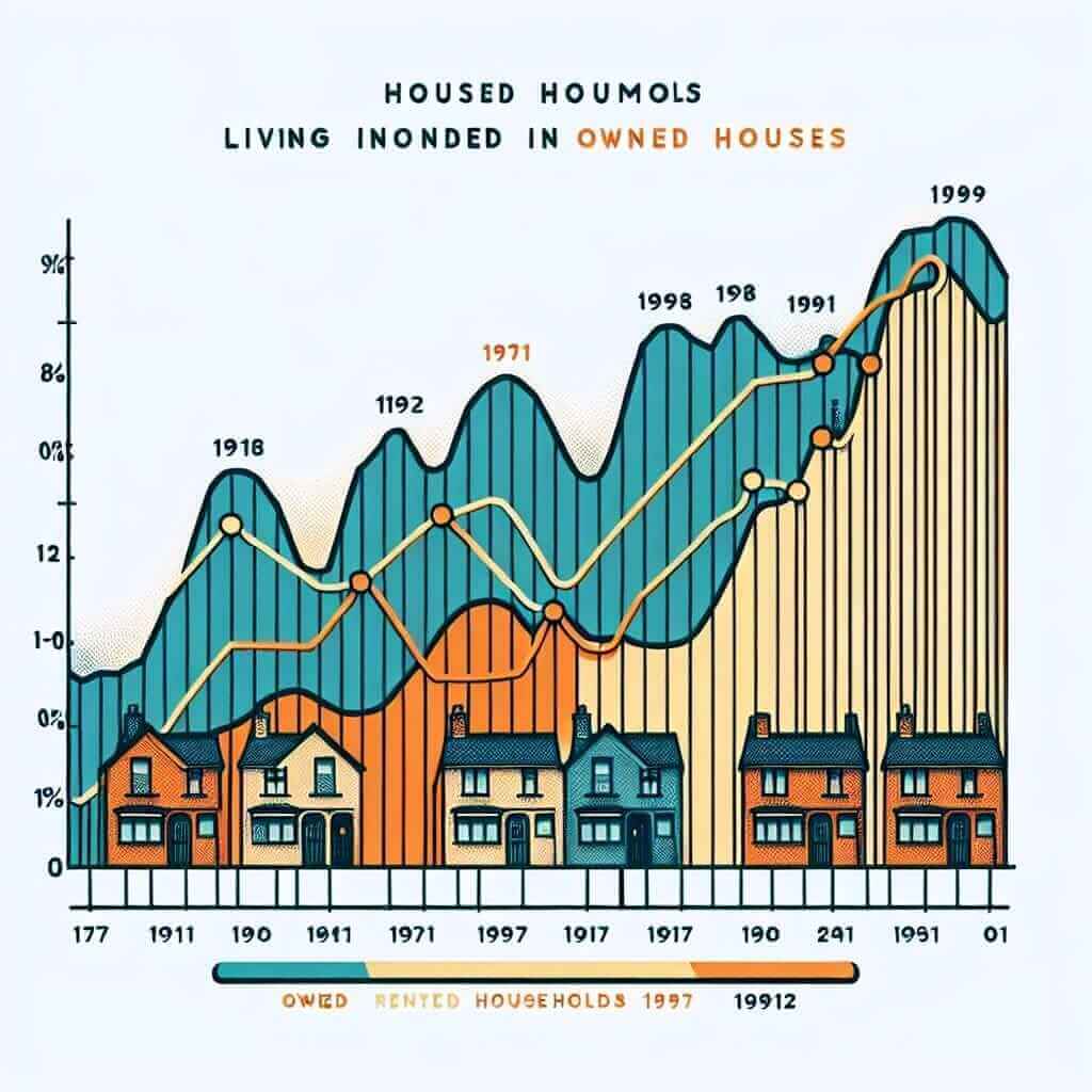
The chart below shows the percentage of households in owned and rented accommodation in England and Wales between 1918 and 2011.
Summarize the information by selecting and reporting the main features, and make comparisons where relevant.

Model Answer (Band 8)
The provided chart illustrates the changing trends in homeownership in England and Wales from 1918 to 2011, comparing the percentage of households in owned and rented accommodation.
In 1918, the vast majority of households lived in rented accommodation, constituting over 75% of the total. In stark contrast, only a quarter of households owned their homes. However, this pattern underwent a significant shift over the next century.
Homeownership witnessed a steady upward trend from 1918 onwards. By 1971, the proportion of owner-occupied households had surpassed that of rented accommodation, reaching just over 50%. This growth continued, and by 2011, owned accommodation accounted for almost 70% of all households.
Conversely, the percentage of rented accommodation experienced a consistent decline throughout the period. After reaching a low point around 1971, the trend plateaued for the next two decades before declining further to just above 30% in 2011.
In conclusion, the chart highlights a dramatic shift from a predominantly renting population towards a majority homeownership model in England and Wales during the 20th century.
Conclusion
By understanding and actively addressing these common mistakes, you can significantly enhance your IELTS Writing Task 1 performance. Remember to analyze the visual information carefully, maintain coherence, use appropriate vocabulary and grammar, and practice regularly. With dedicated effort and a strategic approach, you can confidently tackle this section of the IELTS exam and achieve your desired score.