Mastering the art of describing IELTS graphs is an essential skill for success in the IELTS Writing Task 1. This task requires you to analyze visual data and present your observations in a clear, concise, and well-organized manner. To effectively tackle this section, it is crucial to be familiar with the various types of graphs you might encounter.
Understanding Different Types of IELTS Graphs
There are several common types of graphs that frequently appear in the IELTS Writing Task 1. These include:
1. Line Graphs
Line graphs depict trends over a period of time. They are characterized by a horizontal axis representing time and a vertical axis representing the variable being measured.
Example:
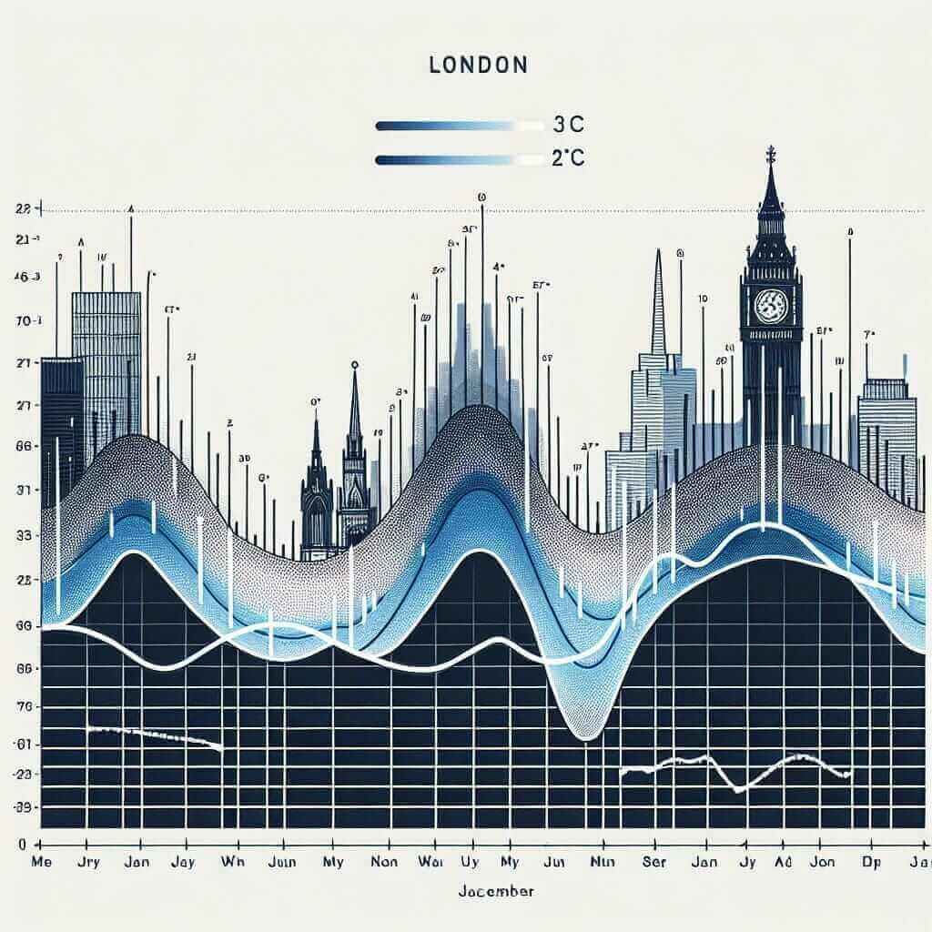
A line graph showing the average monthly temperature in London over a year.

2. Bar Charts
Bar charts compare different categories of data. They use vertical or horizontal bars to represent the values of each category.
Example:
A bar chart comparing the number of students enrolled in different courses at a university.
3. Pie Charts
Pie charts illustrate the proportions of a whole. They are circular graphs divided into segments, with each segment representing a percentage of the total.
Example:
A pie chart showing the distribution of energy sources used in a country.
4. Tables
Tables present data in rows and columns. They are useful for showing a large amount of data in a structured format.
Example:
A table displaying the population of different cities and their corresponding growth rates.
5. Process Diagrams
Process diagrams illustrate the stages of a process or how something works. They use arrows and symbols to show the flow of information or materials.
Example:
A process diagram explaining the steps involved in manufacturing a car.
6. Maps
Maps show geographical information, such as the location of places or the distribution of something over an area.
Example:
A map illustrating the changes in a city’s infrastructure over two decades.
Applying Your Knowledge to IELTS Writing Task 1
Understanding the specific features and purpose of each graph type is essential for accurate data interpretation and effective writing.
For instance:
- Line graphs: Focus on describing trends, significant changes, and peaks or troughs.
- Bar charts: Compare and contrast different categories, highlighting the highest and lowest values.
- Pie charts: Describe the proportions, emphasizing the largest and smallest segments.
- Tables: Focus on key figures, comparisons, and trends within the data.
- Process diagrams: Clearly explain each stage of the process in a logical sequence.
- Maps: Describe the locations, distributions, and changes shown on the map.
Common Mistakes to Avoid
- Misinterpreting data: Ensure you understand the axes, units of measurement, and legends before analyzing the graph.
- Over-describing: Focus on the most significant information and avoid unnecessary details.
- Using inappropriate vocabulary: Use specific vocabulary related to trends, comparisons, and proportions.
- Ignoring the time frame: Always refer to the time period covered by the graph when describing trends.
Practice Makes Perfect
The key to success in IELTS Writing Task 1 is consistent practice. Familiarize yourself with different graph types, analyze sample responses, and write your own descriptions under timed conditions. By honing your analytical and writing skills, you can approach the IELTS exam with confidence.
This comprehensive guide has provided you with valuable insights into the different types of IELTS graphs. Remember to practice regularly, and you’ll be well-equipped to excel in this section of the IELTS exam. Good luck!